UPFINA's Mission: The pursuit of truth in finance and economics to form an unbiased view of current events in order to understand human action, its causes and effects. Read about us and our mission here.
Reading Time: 5 minutes
The Fed funds rate is a hotly debated topic because it’s the main policy tool the Fed uses. There is economic data which can be interpreted to support every argument. Furthermore, after the metrics are taken into account, the goals are subject to interpretation. Just because the core inflation rate goes above 2%, doesn’t mean the Fed needs to hike rates, as we have previously discussed. The Fed could determine that its mandate of creating stable prices is hit when the core inflation is 3%, as an example.
We’ve seen the Fed ignore the data in 2017 because it felt the decline in inflation was transitory. The entire cycle has been confusing if you look at GDP growth. The average real GDP growth during QE and zero percent interest rates was 2.2% and the average GDP growth during the 5 rate hikes and no QE has been 2.1%. This makes it look like the Fed ignores the strength of the economy when setting policy.
Because it can appear policy and the data aren’t related, the market sometimes overreacts to guidance. For example, the stock market sold off after Powell’s Congressional testimony on February 27th because it felt he was slightly hawkish. Fed policy appears to be impacted by the market and forward guidance. Sometimes the FOMC moves the Fed fund futures and sometimes the market causes the Fed to change its tune.
Price Level Targeting Still Has A 0% Fed Funds Rate
The chart below shows how the Fed funds rate would have looked under various policy rules.
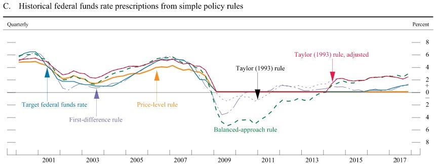
Various Rules Applied To The Fed Funds Rate
In a previous article, we discussed price level targeting, which is when the Fed looks at the average inflation over time to come up with policy. For example, if inflation is below 2% for a few years, the Fed will allow inflation to go above 2% for a few years. This policy is very dovish because it essentially allows the Fed to ignore inflation because it has been below the target for most of this expansion. There could be a few years of 3% inflation without a problem. This is why the yellow line in the chart above, which represents that policy, has the Fed funds rate at 0%. It’s interesting to see discussions of this in 2018 because the Fed is already far away from that prescription.
These examples are all over simplified versions of various rules. By tweaking the Taylor Rule formula and the inputs, you can justify any policy stance. The Fed uses these formulas to get an estimate of where the fed funds rate should be. It’s not surprising that simply comparing GDP with policy would yield confusing results when you consider the complex formulas created to set policy. It’s up to readers to decide if the Fed does a good job utilizing these formulas. Some may think it should just go with the basic data points, broken down to adjust for any irregularities. The other option is letting the market set rates. We mentioned previously, how the market does play a role in adjusting the Fed fund futures. Some criticize the Fed for bending to the whims of the market as stock selloffs can cause the Fed to change stance, despite what their complex formulas state.
Current Central Bank Policy Is Hawkish?
The chart below is a great summary of where the global central banks have set policy. It shows the 5 year rolling average of interest rates from the Fed, ECB, and Bank of England.
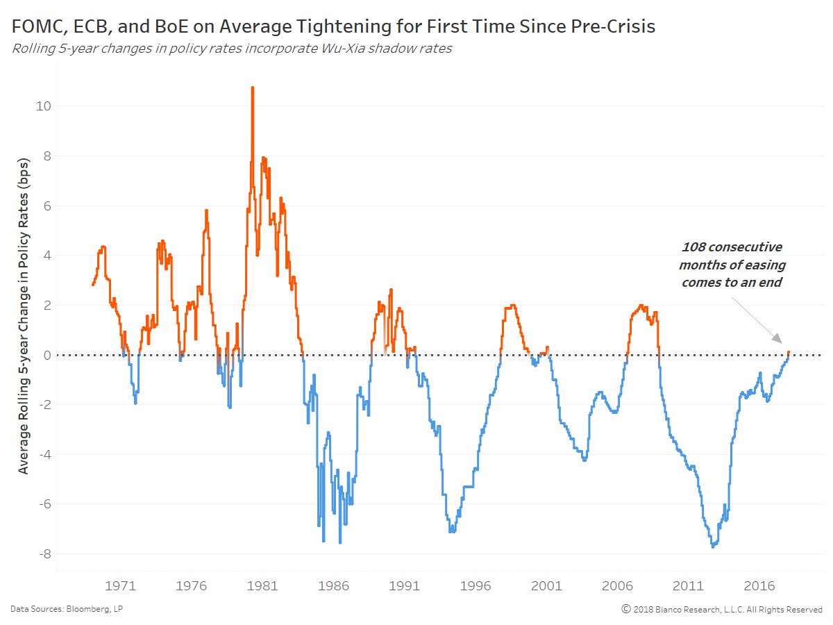
5 Year Rolling Average Of Global Monetary Policy
This chart incorporates the shadow rate which means it includes the effect of QE and QE tapering. QE is one reason why it turned negative in the early 2010s. It’s notable how the rolling change hit similar troughs in the past few cycles. The central banks replaced some rate cuts with QE since rates hit the zero bound. While some central banks went negative, as ridiculous as that is in of itself, they didn’t go much below zero.
One of the obvious criticisms of this chart is it includes the Bank of England instead of the Bank of Japan. However, the recent results wouldn’t be much different because both central banks are still dovish. The Fed has been the main catalyst for the increase in rates in this chart, making this is the first time the 5 year rolling average has gone positive in 108 months.
Another criticism of this chart is it just shows the change. Rate increases don’t necessarily mean the central banks are hawkish. The line has mostly been in the negatives in the past 30 years as interest rates have been in a secular downtrend. Even though the Fed has been the most hawkish, the Fed funds rate is below both the Taylor Rule and the year over year CPI with the Fed Funds Rate to Taylor Rule ratio being the most dovish since 1970. Inflation accelerated at the end of 2017 and early 2018, signaling monetary policy wasn’t stopping price increases. If the Fed isn’t hawkish, then none of the other major banks are hawkish since the Fed has raised rates the most and shrunk the balance sheet unlike the other central banks, which have increased theirs.
The final criticism of this chart is that there are different economic regimes included. If the 10 year bond heads in an upturn because real interest rates are increasing due to accelerated economic growth and because inflation perked up, the line would be above zero for a while without signaling a recession.
Those caveats aside, this chart seems to agree with the yield curve that a recession is going to occur in about 2-3 years because that’s generally around the length of time the 5 year moving average stays above zero.
Effect Of ECB’s QE
We’ll leave you with the chart below which shows the effect of the ECB’s private sector purchase program.
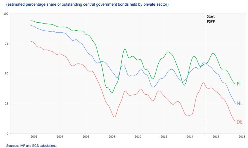
PSPP Crowds Out Private Investment In Government Bonds
When this part of QE was implemented in 2015, the estimated percentage of central government bonds held by the private sector declined. The private investors were crowded out of the market, pushing down yields in other bonds when they deployed their capital elsewhere. The German, Finnish, and Norwegian bonds are all held near their respective rate that occurred during the 2008 financial crisis.
Conclusion
The Fed raised rates 3 times without any problems in 2017, but it is facing slight push back from the stock market in 2018 following Powell’s announcement for the potential for four hikes. To get an idea of which path the Fed will take, you need to analyze the data, read to the Fed statements, and place the data in context of current market sentiment. The quickest way to figure out what the Fed will do is to look at the CME Group Fedwatch Tool.
Have comments? Join the conversation on Twitter.
Disclaimer: The content on this site is for general informational and entertainment purposes only and should not be construed as financial advice. You agree that any decision you make will be based upon an independent investigation by a certified professional. Please read full disclaimer and privacy policy before reading any of our content.