UPFINA's Mission: The pursuit of truth in finance and economics to form an unbiased view of current events in order to understand human action, its causes and effects. Read about us and our mission here.
Reading Time: 6 minutes
In previous articles, the groundwork for how the current financial bubble was created has been explained. You can read them here, here, or here. To summarize, central banks have collectively pumped trillions of dollars into the system by buying assets. This lowered fixed income yields to record low levels. There were many cases where government debt had negative yields. The concept of paying governments for the privilege of lending them currency was initiated as textbooks had to rewrite the description of what a loan’s parameters are. These record low interest rates did two things. They increased the corporate debt to the highest level ever and caused investors to take more risk to get a decent return. The usual concept of ‘low risk, low return’ stopped existing as it was changed to ‘low risk, no return’.
In this article, there will be further discussion of some of the specifics of the bubble. It’s debatable whether the term ‘bubble’ should be used in an objective article. You can either decide the term is implying a bearish opinion on risk assets or that the term is an accurate depiction of record high valuations. The goal of this article is to reinforce the notion that the latter description is more accurate than the former.
As was mentioned, corporate debt issuance has reached a record high as it has been spurred by low interest rates and a higher appetite for risk.
The chart below shows a breakdown of the debt outstanding in the U.S. economy.
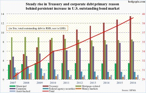
As you can see, the mortgage related debt fell until 2013 and has risen moderately since then as there are still remnants of the housing bubble burst a decade ago. Whenever a bubble bursts, investors generally do not return to that asset again in the next cycle, however it appears the lessons of 2008 have long been forgotten. It took until 2015 for the Nasdaq to break out of the high it saw at the apex of the dot com bubble back in early 2000s. Each bubble has been caused by low interest rates and investors paying more for assets then they’re worth in the long-term as a function of being overly optimistic about company’s future cash flows. The difference is the vehicle which houses the bubble.
The two debt instruments which have driven the increase in debt are treasuries and corporate bonds. It’s amazing to see the amount of this debt increasing as the interest rates decrease. You would think demand would wane when supply increased, but the Federal Reserve’s $3.7 trillion in bond purchases and institutional investors and foreign governments flush with dollar reserves have soaked up the supply for the past 9 years, but that is slowly beginning to change.
There’s also a fundamental reason for how corporate debt issuances can increase while yields decrease. The reason is company default rates have fallen in this bull market cycle and profits have rebounded, as a function of low interest rates on debt. Default rates did increase in 2016, but that was due to the weakness in the energy and mining sector.

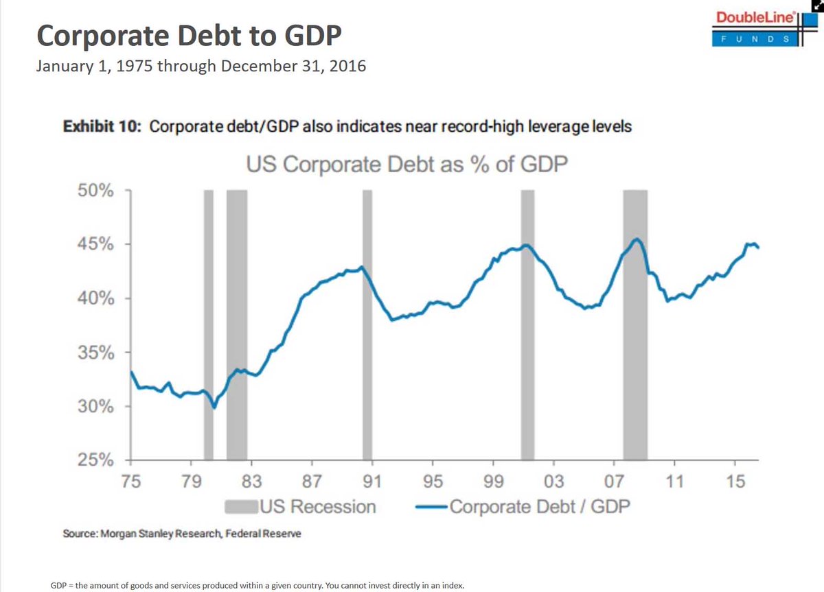
The way we square how the growth effects impact the level of corporate debt is looking at the corporate debt to GDP ratio.
The chart below shows the three financial bubbles clearly defined:

As was mentioned, investors have been piling into stocks because fixed income has provided low returns. This is called moving up the risk curve.
The chart below shows two valuations metrics which are at extraordinary levels because of this increased risk level.

Taking high risk has become normal because returns need to be had. It’s not possible for pension funds to accept the low returns bonds offer, as many are underfunded as is (a topic for a different discussion). They must take more risk because the risk of being underfunded due to low returns is worse than the risk of stocks falling.
Specifically, the red line in the chart above shows the S&P 500’s price to sales ratio which is at a record high. The price to sales ratio is a great metric because it doesn’t consider profit margins. Profit margins move up and down, but usually regress to the mean. The high profit margins of today make stocks look cheaper than they really are because the heightened margins cannot last indefinitely. The blue line shows the equity market cap to GDP ratio. This chart is like the corporate debt to GDP chart in that it clearly defines the three bubbles which have been created by loose monetary policy.
The only way profit margins could continue a sustained move higher is if the population of the United States had a high savings accrual and was not indebted. But this chart clearly suggests that debt levels are reaching those of 2008.
Remember, the economy moves in cycles up and down, nothing happens indefinitely:
However, instead of allowing the economy to function as a self correcting mechanism, throughout history governments have attempted to stimulate continued economic growth despite the unavailability of savings, through the creation of currency and the artificial simultaneous reduction in the interest rate, thereby artificially fueling demand and the illusion of a population that has a large amount of savings to fund future growth.
These actions by central banks and governments create unsustainable artificial periods of economic growth, only to be followed by a very real economic contraction that has far reaching generational consequences on the population, something which happened following 2008.
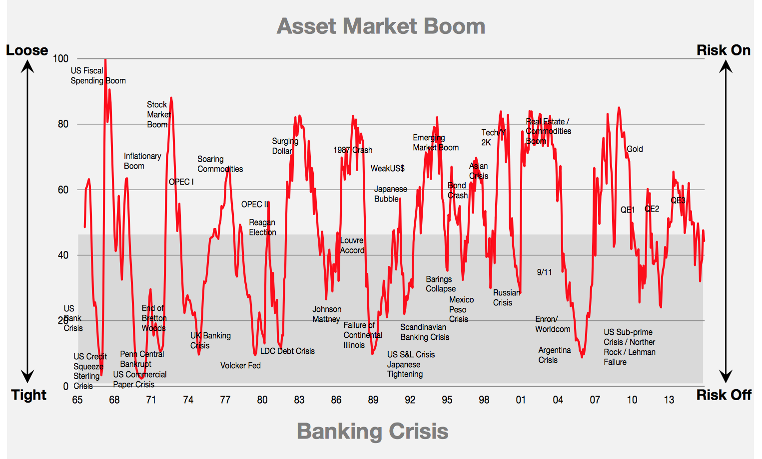
As was mentioned, the loose monetary policy standards have created the bubbles. Loose monetary standards have always created a ‘risk on’ environment. This term refers to when investors buy risk assets, paying higher valuations for them. The market moves between ‘risk on’ and ‘risk off’ based on the liquidity the central bank provides. Volatility (perception of risk) in the market increases in select areas or most areas when the Fed has a tight monetary policy.

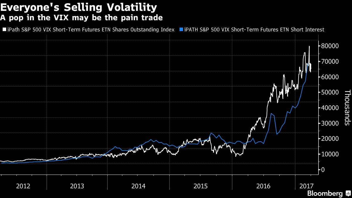
As you can see in the chart above, now that QE 1,2, and 3 have expired, the central bank’s policy has become more hawkish (tighter). If the Fed raises interest rates and unwinds the balance sheet, the red line will sink lower. Volatility was mentioned to be low in times of loose policy and high in times of tight policy. However, even with the tightening policy, volatility has been low lately. Q1 2017 was the second lowest month for volatility since the VIX was created. The VIX is a market instrument that measures the level of volatility. The chart below supports that data point. As you can see, bets against the VIX have increased steadily. Selling the VIX is like buying the stock market because the VIX acts inversely to the stock market. When a trade gets crowded like this one, a sudden burst can create a sharp move as the flood gates open and traders panic. This burst would accelerate a move to the downside in stocks.
Conclusion
A description of the parts of the financial bubble was given in this article. Parts of the debt bubble which were not mentioned, but are key to the bubble are the student loan and auto loan bubbles. Both were also created on the back of low interest rates. In the mid-2000s, the government encouraged people to buy houses in a low interest rate environment. In this cycle, the government encouraged students to take out loans to go to college in a low rate environment. When interest rates rise again, it will expose the bubble.
Or as Warren Buffet puts it:
“Only when the tide goes out do you discover who’s been swimming naked.”
Have comments? Join the conversation on Twitter.
Disclaimer: The content on this site is for general informational and entertainment purposes only and should not be construed as financial advice. You agree that any decision you make will be based upon an independent investigation by a certified professional. Please read full disclaimer and privacy policy before reading any of our content.
