UPFINA's Mission: The pursuit of truth in finance and economics to form an unbiased view of current events in order to understand human action, its causes and effects. Read about us and our mission here.
Reading Time: 5 minutes
There are mischaracterizations of the stock market which can confuse investors and push them in the wrong direction. The problem with social media and people selling investing subscription services is that misinformation can spread quickly and there’s no consequences for being wrong. In fact, sometimes being wrong is more profitable than being right. When your customer base has a religious zealotry towards a position, there’s no questioning if the math or thesis are correct. There is a strong cohort of investors who rely on faith instead of rigorous analysis. The reason is that rigor is hard. The difficult part isn’t doing the research; it is recognizing when you’re wrong. There are many investors who would rather not admit they were wrong even if it costs them money. This is the customer base for purveyors of poor analysis. We’re not hinting that these purveyors have malintent. They probably don’t want to admit they were wrong either.
Warren Buffett said “when the tide goes out, you can see who is swimming naked.” Usually that quote is meant to explain what happens when the stock market crashes; investors who were relying on the market going up without utilizing skill look terrible when there’s a recession. However, that quote can be applied in reverse. Now the tide is going out on short sellers because stocks are in a long bull market. Only the best short sellers can survive in this market. Only the best analysis makes sense. At the onset, all bears have been wrong in the past few years. There’s nothing wrong with making a bad forecast. What is bad is when there’s faulty analysis and bad math. It’s easy to see which bears are bad analysts when the market is on a great run. We’ll look at an example of misleading points bears have made in this article
The FRED Nonfinancial corporate business chart shows the debt in non-financial institutions. If you look at the chart on its own, the picture is grim because it makes it look like the amount of debt is out of control. Then this chart is combined with the fact that there has been a big uptick in stock buybacks which have helped fuel this bull market, to make the point that this is a leveraged rally which is about to collapse.
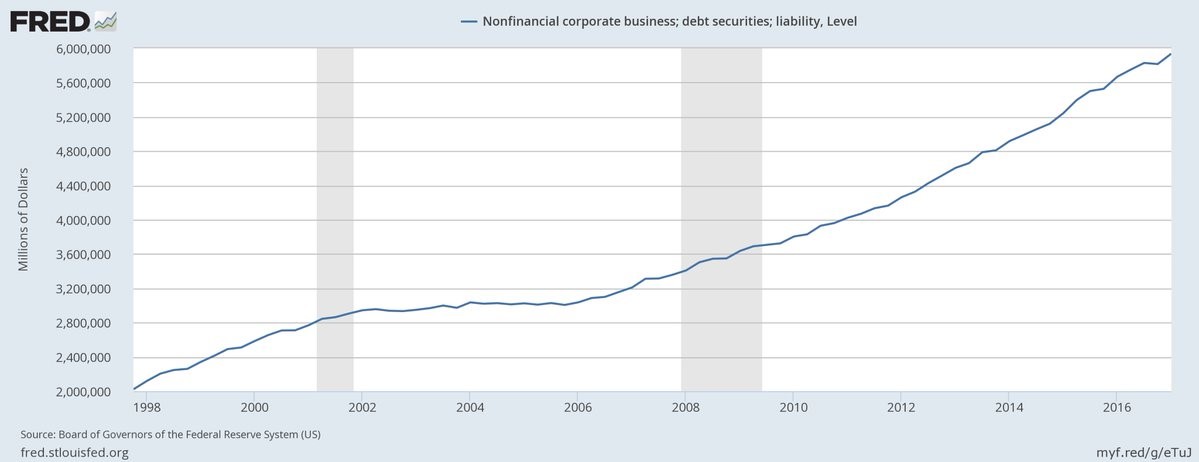
Total Non-financial Liabilities
The one tangential part of this argument which is true is that debt financing is cheap relative to equity financing, which we examined in depth in the cost of equity article, so it makes sense to conduct stock buybacks. Some companies issue more debt than they make in profits, undergoing a debt for equity swap. The problem with that point is only some companies are undergoing a debt for equity swap. On aggregate, companies are funding buybacks with profits.
The FRED Nonfinancial Corporate Business Total Assets chart shows how in total there hasn’t been a debt for equity swap. The chart shows the total assets increasing the same way the total liabilities are increasing. The only difference is during recessions liabilities grow much faster than assets which sometimes fall. It’s painfully obvious to see that assets have grown with liabilities. It shows how profits (not debt) have driven most buybacks. Some bears use the fact that inflation is low and liabilities are high to make the point that we’re in a unique period; that’s not true in reference to the size of corporate debt.
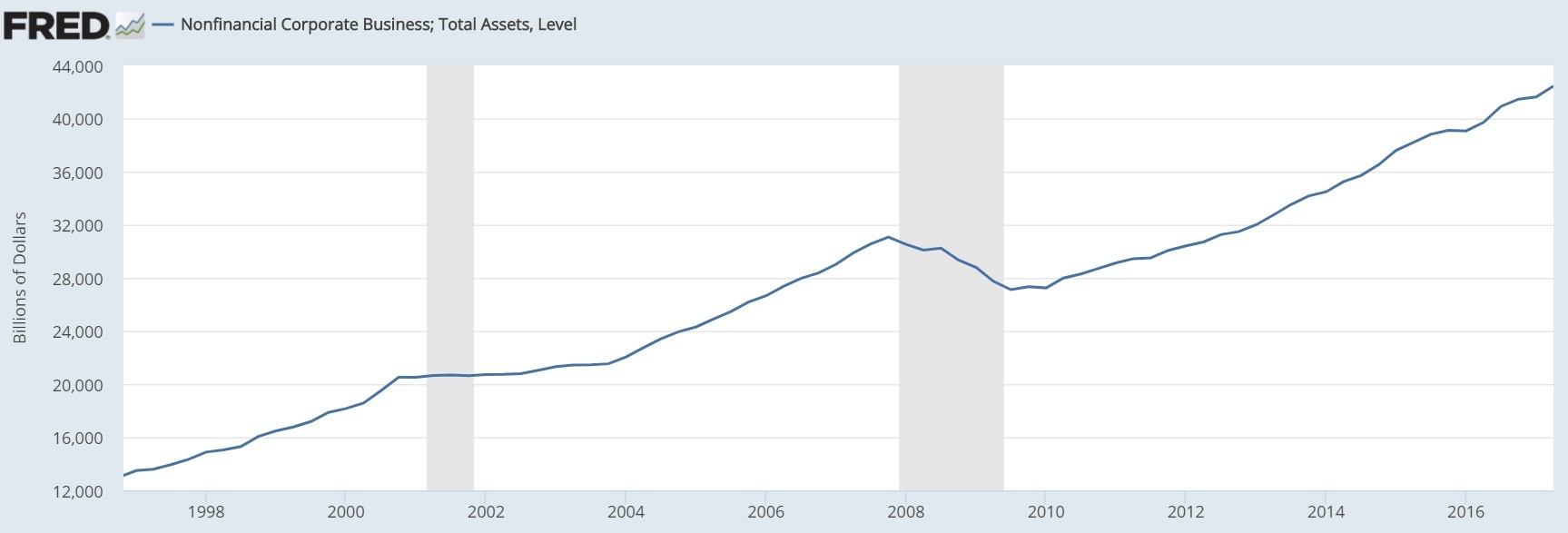
Total Non-financial Assets
If profit growth stalls, then buybacks will fall. If interest rates rise, debt will get more expensive, hurting profits. These are obvious points which always exist. There’s never a point where heightened inflation and declining profits are good. The unique points which the bears are correct about which we’ve mentioned before are that stocks have historically high multiples and the use of cov-lite loans has never been this popular. There’s no need to make up bear cases for stocks.
The Debt/Equity GVA chart below gets to the heart of the wrong argument being promoted by bears.
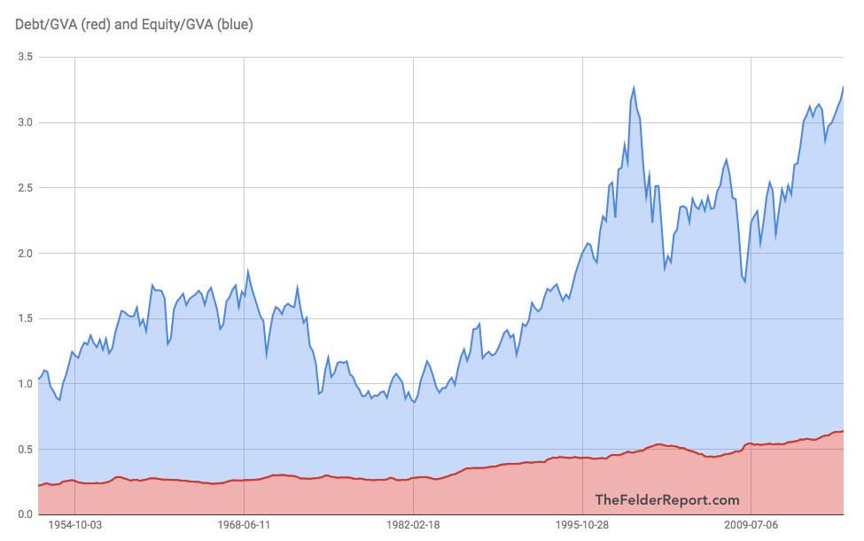
Debt To Equity GVA
The red line shows the debt to sales ratio and the blue line shows the debt to equity ratio. Both have increased. The problem with comparing sales to debt is that debt isn’t payed off in sales; it’s paid off by the profits. Profit margins are at historical highs which makes the situation much better. You can argue profit margins will mean regress, but anytime margins fall it’s bad, making this situation not special. The price to sales ratio is high which is why the blue line is near a record. This issue is cherry picking valuation methods as most stats such as price to earnings multiples say stocks are more expensive than average, but few say they are more expensive than the late 1990s/early 2000s peak. The Shiller PE is currently at a 30 handle; it was in the low 40s during the early 2000s.
We’ve reviewed how the debt to sales ratio and the price to sales ratio aren’t great metrics. The Total Debt To Equity for The United States explains why the relationship between the two ratios isn’t problematic.
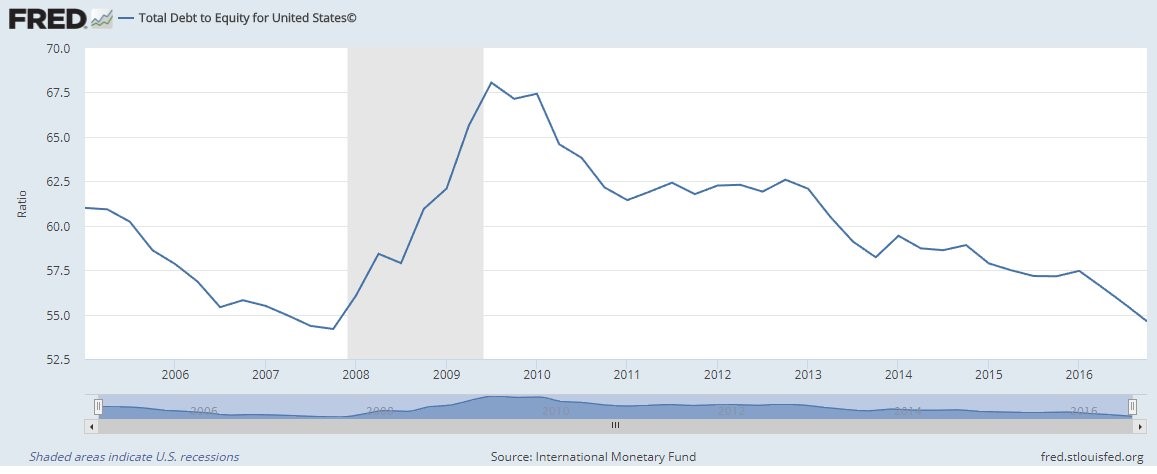
Debt To Equity Ratio
The ratio of equity/gross value added to debt/gross value added is 4 to 1 which is the same as the long term average. The debt to equity ratio has been in decline since the last recession. This reinforces the point we made earlier about liabilities growing faster than equity during recessions. If there is another recession, the debt to equity ratio will increase again; stocks will probably reflect that by selling off. Calling out a recession as being bad news isn’t a groundbreaking point.
Trailing 12 month buybacks show the decline in buybacks.
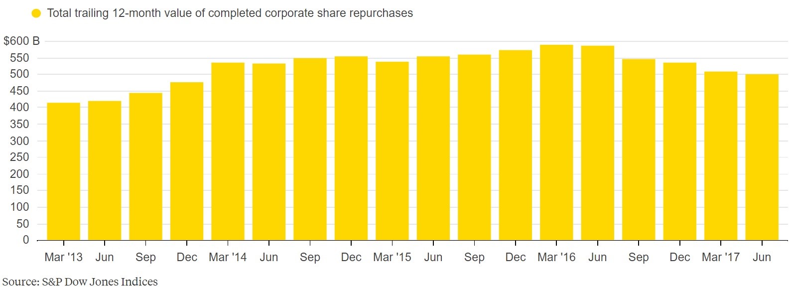
Trailing 12 Month Buybacks
The decline might be a delayed effect from the earnings recession in 2015-2016 or it might be a change in the way firms allocate capital. This may or may not be a negative for stocks. Buybacks return capital to shareholders by providing a bid for stocks, lowering the shares outstanding. If the capital is there from earnings, but not used for buybacks, then whether or not buying back stock is good or bad depends on the returns obtained on the new investments. Just keeping the money in cash wouldn’t be a great decision unless firms thought their shares were overvalued. The point is calling this decline a negative for stocks is simplistic analysis which may not be correct.
Conclusion
Hopefully we busted some myths on how corporations return capital to shareholders and on their relative leverage. Profits are at record highs and so are liabilities. Only focusing on one would be effectively falsifying information. Looking at these charts makes the bearish arguments look silly, but don’t feel disheartened if you were fooled. It’s only bad if you hear good arguments and you choose to ignore them.
Have comments? Join the conversation on Twitter.
Disclaimer: The content on this site is for general informational and entertainment purposes only and should not be construed as financial advice. You agree that any decision you make will be based upon an independent investigation by a certified professional. Please read full disclaimer and privacy policy before reading any of our content.