UPFINA's Mission: The pursuit of truth in finance and economics to form an unbiased view of current events in order to understand human action, its causes and effects. Read about us and our mission here.
Reading Time: 5 minutes
Headline September job growth missed estimates, but the positive revisions to the July and August readings were bigger than the September miss. This explains why it’s best to look at the report holistically. There’s temptation to just look at the most recent month to get an early look at the economy, but sometimes the data shifts. Ultimately, it should make no difference in your analysis if job growth occurs on August 29th or September 2nd.
Specifically, the July jobs report was revised to show 165,000 jobs were created instead of 147,000. The August report was sharply revised higher from 201,000 to 270,000. As you can see, there were 87,000 more jobs created in the prior two months than were initially reported. That improvement is more than the September miss. 180,000 jobs were expected to have been added in September, but only 134,000 jobs were created. When you look at the headline report from that perspective, the results weren’t bad.
Bad Weather Was A Minor Factor
Hurricane Florence was a minor factor on this jobs report. Since the headline only missed by 46,000, this factor had a big influence on the miss. As you can see from the chart below, there were over 300,000 people who weren’t at work due to bad weather in September. This is more than the average which is below 250,000.
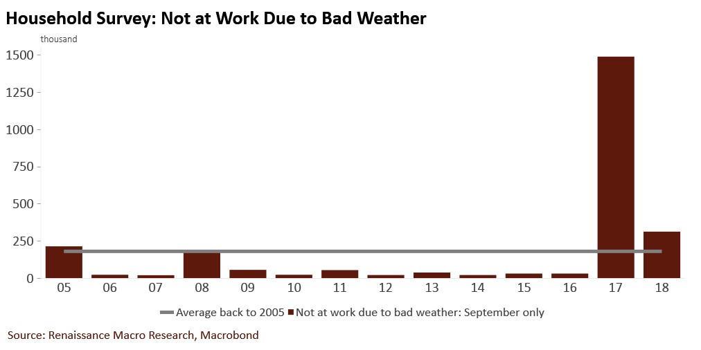
The bars in the chart only show data from September, making it easy to see how the combined effect of hurricanes Maria, Harvey, and Irma was much more severe than hurricane Florence. This gives you an idea of how much of an impact hurricane Florence will have on Q3 GDP growth (it’s estimated to be from 0.2% to 0.3%).
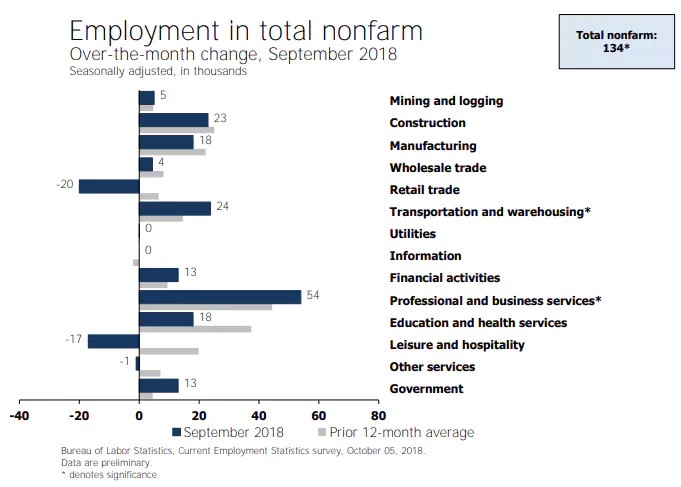
Hurricane Florence likely had the biggest impact on the retail trade and leisure and hospitality industries. Since we know which industries were hit the hardest, we can look at the job creation in each industry to see the impact. As you can see from the chart below, the retail trade industry lost 20,000 jobs, which was much less than the 1 year average where it has added about 10,000 jobs per month. The leisure and hospitality industry lost 17,000 jobs instead of adding about 20,000 jobs.
The difference between the September job losses and the average job creation in the past year in those two industries is much larger than the size of the September miss. The hurricane struck the Carolinas at the end of the mid-month sample week and was a minor factor which affected job growth. Keep in mind, the job growth in those industries wouldn’t necessarily have been at the 1 year average without the hurricane.
One other notable part of the chart above is it shows manufacturing added 18,000 jobs which beat estimates for 10,000. Furthermore, the August reading was revised to show 5,000 jobs added instead of 3,000 lost. Some of the regional Fed manufacturing reports showed manufacturing employment growth slowed, but this report was solid.
Other Indicators Don’t Agree With BLS Reading
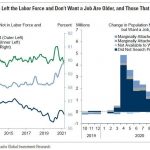
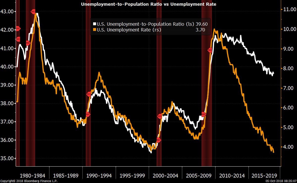
It’s also worth noting what other indicators suggest about certain aspects of this report. The September non-manufacturing ISM employment reading was the best ever, jobless claims were very low, and the ADP report showed 230,000 private sector jobs were added, but there only ended up being 121,000 created. Those positive reports weren’t consistent with headline job creation, but they were in concert with the unemployment reading seen in the chart below. The unemployment rate was the lowest since 1969 as it fell from 3.9% to 3.7% which beat estimates for 3.8%.
One dangerous aspect of following the unemployment rate is it can be manipulated by the number of people looking for a job. In the September report, the number of new jobs created missed estimates, but the number of people looking for a job fell from 6.235 million to 5.964 million. It’s not ideal for the number of people looking for a job to shrink. After the recession people gave up looking for a job because they were discouraged.
Labor Force Participation Ratio
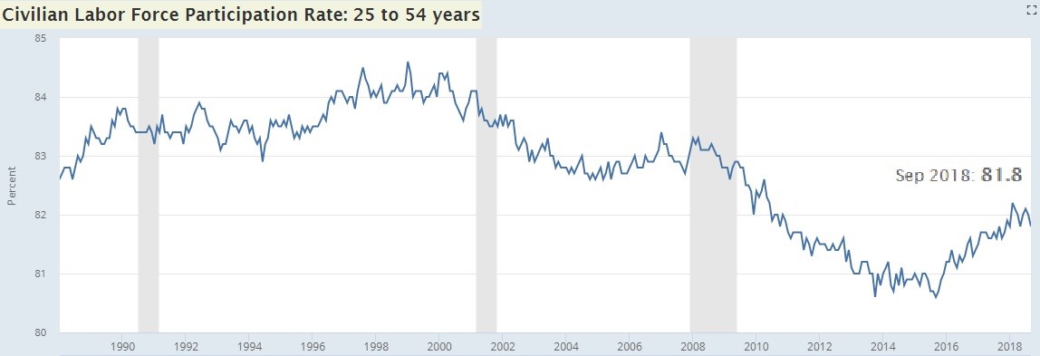
The Bloomberg chart above compares the unemployment rate to the employment to population ratio. Part of the reason the two have diverged is because baby boomers have retired. It’s better to look at the prime age labor force participation ratio. The overall labor force participation ratio was flat at 62.7%, but the prime age labor force participation ratio fell from 82% to 81.8%. This is bad news in the sense the labor market didn’t improve, but it’s good news that there is more slack in the labor market.
As you can see from the FRED chart below, there is plenty of room for the rate to improve without running out of slack. That being said, wage growth is still increasing because productivity growth is improving and some industries have a labor shortage. The labor market isn’t uniform. Some areas like trucking are running out of workers, but that may also have been due to seasonal demand as a result of the hurricanes.
Another Increase In Wage Growth
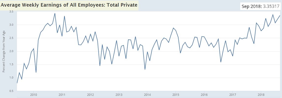
Year over year average hourly wage growth missed estimates as it fell from 2.9% to 2.8%. The average workweek was steady at 34.5 hours. Even though average hourly earnings growth missed estimates, the more important measurement of wages, weekly earnings growth, accelerated to 3.35%. This is the 3rd highest reading of this expansion. The other two higher readings were in October 2010 and June 2018. With the slack shrinking, wage growth should make a new cycle high soon.
We have been following the increase in long term treasury bond yields in the past few weeks. It started in early September when August hourly earnings growth was 2.9%. While the September reading decelerated slightly, it won’t stop treasury yields from increasing as weekly wage growth improved.
Conclusion
The September labor report was mixed. There were big positive revisions to job creation in July and August. Job creation in September missed expectations. However, one reason for the miss was hurricane Florence. A big negative was the decline in the number of people searching for work. That makes the decline in the unemployment rate not good news. However, there have been other months this cycle where the rate increased as more people entered the labor market.
Have comments? Join the conversation on Twitter.
Disclaimer: The content on this site is for general informational and entertainment purposes only and should not be construed as financial advice. You agree that any decision you make will be based upon an independent investigation by a certified professional. Please read full disclaimer and privacy policy before reading any of our content.