UPFINA's Mission: The pursuit of truth in finance and economics to form an unbiased view of current events in order to understand human action, its causes and effects. Read about us and our mission here.
Reading Time: 5 minutes
Our goal is to present the best bullish and bearish cases for markets and the economy. We try to improve your and our own understanding of markets to make the smartest decisions. We write articles to counter silly arguments made by pundits, such as claiming stocks fell on Tuesday because Wednesday was a holiday. Following that logic, stocks should crash every Friday.
In this article, we will present some of the bullish points as to why the latest yield curve inversion doesn’t pose a near term threat to stocks. If you expected this cycle to be average, you would have overestimated the average annual GDP growth rate and underestimated the length of this expansion. Following that logic, don’t assume the stock market and economy will follow the average period following yield curve inversions. Furthermore, the curve could be wrong as it doesn’t have as good of a track record in international economies such as Japan.
Some Yield Curve Inversions Are Irrelevant
The chart below suggests that yield curve inversions such as when the 2 and 3 year bond yields recently moved higher than the 5 year bond yield are irrelevant. It’s common to see many parts of the curve invert at once because the differences compress when it flattens. As of early December, most of the curve isn’t inverted, which is what matters.
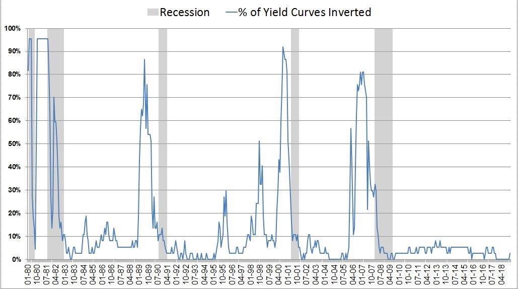
Source: Twitter @Solomon_Slate
The chart above shows when only part of the curve inverts, there’s a chance the inversion will give a false positive recession warning. Look for 80% of the curve to invert before expecting a recession. This doesn’t mean we should discount the latest inversion entirely. When some parts of the curve invert, the rest can follow very quickly. Whether you’re on the bullish or bearish side of the debate, you need to bring more to your analysis than just looking at the yield curve.
ISM & PE Multiples
We follow the ISM closely because it has been a good predictor of stock returns. The two charts below map stock returns based on the ISM manufacturing index and changes to the market’s PE multiple.
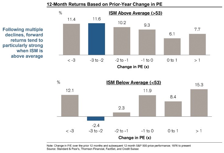
Source: Credit Suisse
As you can see from the top chart, when the ISM is above 53, every scenario has positive returns. When the PE multiple shrank in the prior year, meaning stocks got cheaper, returns have been better. In the current situation, the ISM is above 53 and the prior 12 month change in the PE multiple is between -3 and -2. That brings 11.6% returns in the next 12 months.
The returns are much different if the ISM PMI is below 53. In that scenario, the best performance occurs when the PE multiple increases. That’s likely because the stock market and economy have momentum. If the ISM was below 53, the current scenario would have the worst returns as stocks would fall 2.4%. In that case the economy would be weakening and stocks would be falling. Returns are better when the PE falls over 3 as stocks may have fallen too far and gotten cheap. Keep in mind, PE multiples rarely fall more than 3 points, making this potentially immaterial data.
November Manufacturing ISM
The November ISM manufacturing index was spectacular as it gave bullish investors a data point to hold onto during the volatility in early December. The PMI was 59.3 which was above the October reading of 57.7, above estimates for 57.2, and above the high end of the consensus range which was 58.3. This PMI is consistent with GDP growth of 4.9%.
The new orders index increased 4.7 points to 62.1. The prices index fell 10.9 points to 60.7 because oil prices fell 22% in November which was the biggest monthly decline in a decade. The themes from the quotes in the report were that there are labor shortages, tariffs are increasing metals prices, growth is strong, and oil prices fell. A furniture and related products firm stated,
“Business [orders] steady. Many customers [moving] orders up due to price increases [from commodity costs and tariffs].”
Earnings Estimates Falling
Q4 and 2019 full year earnings estimates are falling, but they are still outperforming the historical average. The question is if the trend where revisions outperform drastically to marginally continues to where they eventually underperform the average. In other words, the positive difference between current revisions and the long run average of revisions is shrinking.
The two charts below lay out the recent change.
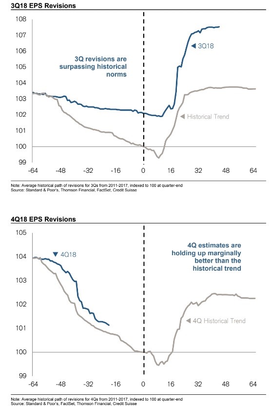
Source: Credit Suisse
Q3 earnings estimates fell less than average and then results beat estimates by more than average. Q4 isn’t as great as Q3 since estimates are falling quicker. They are still falling less than average. On October 1st, 2018, estimates for Q4 sales growth were 15.37%; now they are only 11.56%. Earnings growth estimates decreased from 15.37% to 11.59% in that period.
The top chart below shows the tax cuts boosted 2018 earnings estimates in the beginning of the year; then GDP growth beating estimates helped boost earnings revisions later in the year.
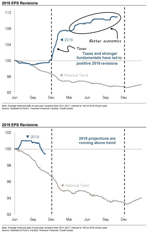
Source: Credit Suisse
The stock volatility in the fall is about 2019 results. Anyone who claims stocks should rally because 2018 earnings growth was solid is looking in the rear-view mirror. As you can see from the bottom chart above, even with some of the negative economic catalysts being priced in, the decline in earnings estimates is better (less) than average.
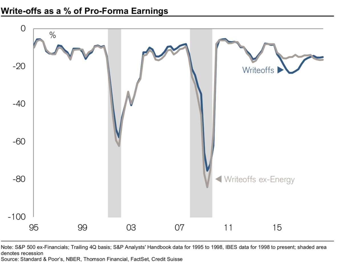
No Recession Yet
Earnings are a key signal for the economy as they allow firms to spend on capex and hire new workers. A rising stock market increases the upper class’ consumer confidence reading which helps retailers. As you can see from the chart below, the earnings quality indicator is positive just like every indicator except inflation.

Source: Credit Suisse
Good earnings quality means the gap between pro-forma and GAAP earnings isn’t increasing and write-offs as a percentage of pro-forma earnings aren’t high.
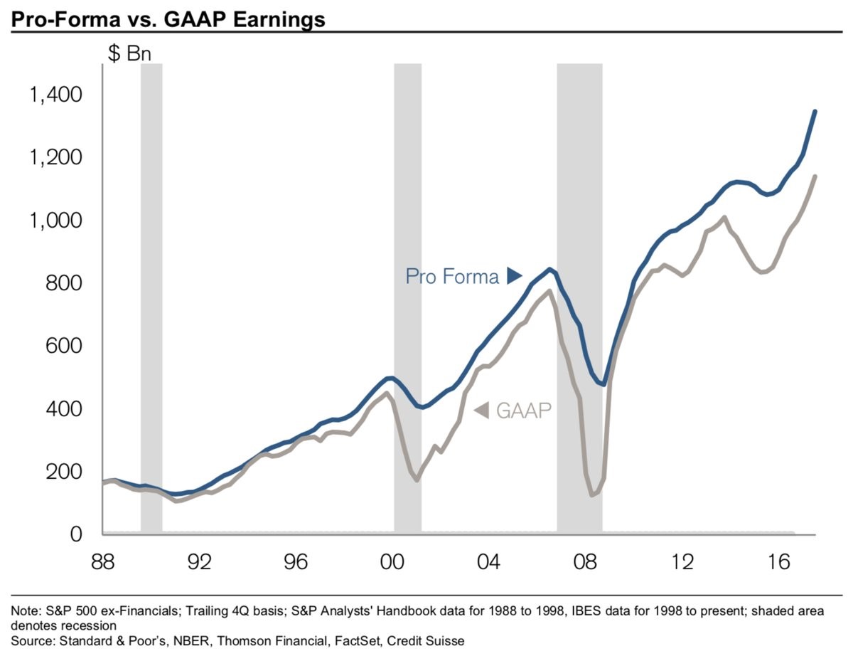
When earnings are weak, firms can use accounting tricks to put lipstick on the pig that is GAAP earnings to make pro-forma earnings look good. That occurred in the earnings recession in 2016.
Conclusion
The stock market has witnessed increased volatility whereby traders are panicking over the yield curve. We showed the reasons to sell in a previous article and the reasons to buy in this article. Whichever side you chose, avoid acting on emotion. The yield curve needs to be almost fully inverted for there to be a recession. An interesting argument to consider however is here, where we discussed how its possible for a positive yield curve to signal a recession. The ISM composite and manufacturing indexes signal the economy is growing. Earnings estimates are falling, but they are still outperforming the historical average.
Have comments? Join the conversation on Twitter.
Disclaimer: The content on this site is for general informational and entertainment purposes only and should not be construed as financial advice. You agree that any decision you make will be based upon an independent investigation by a certified professional. Please read full disclaimer and privacy policy before reading any of our content.