UPFINA's Mission: The pursuit of truth in finance and economics to form an unbiased view of current events in order to understand human action, its causes and effects. Read about us and our mission here.
Reading Time: 5 minutes
Some economic statistics have a very high correlation with the stock market. It’s important to follow them while looking for reasons why the correlation can end. Some say when an indicator becomes followed too closely, it loses all meaning. The jobless claims have historically been correlated with stocks. The question is if this labor market, which has been relying on workers coming off the sidelines to fill jobs, will continue to correlate with equities. The jobless claims to labor force population ratio is at a record low. That hasn’t prevented the labor market from continuing to grow as the prime age labor force participation ratio still hasn’t signaled the labor force is full. So far this cycle, jobless claims have correctly predicted the market’s bull run.
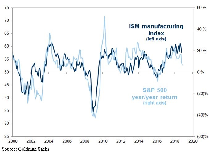
Another stat that is correlated with the S&P 500 is the ISM manufacturing index. As you can see from the chart below, the ISM manufacturing index has been falling along with the year over year returns in the S&P 500.

Source: Goldman Sachs
It’s interesting because the correlation has remained tight even though the PMI has been consistent with higher rates of growth than what actually occurred. The stock market has followed the ISM PMI instead of the economy. Clearly, investors pay close attention to the index. The good news for manufacturing firms is input costs should fall because of the collapse in oil prices. However, weak global growth and tariffs will hurt manufacturers. Every ISM manufacturing report includes complaints about tariffs. The question is how much the trade war will hurt the index because we saw complaints even with amazing PMI readings.
Yield Curve Already Signaling Problems?
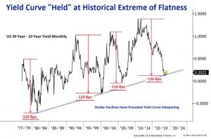
The most followed part of the yield curve is the 10 year yield minus the 2 year yield. It’s not the only differential to follow, but most act similarly and have similar track records. However, it doesn’t hurt to follow all parts of the curve. The chart below shows the 30 year yield minus the 10 year yield is already flashing a recession warning sign even as the difference between the 10 year yield and the 2 year yield is still positive which means the curve is normal.
Source: Nautilus Research
Since the late 1970s, the difference between the 30 year and the 10 year as been troughing at higher levels. This is interesting because most consider an inverted curve as an early warning sign of a recession. However, the increasing trend might put this cycle’s trough at a positive differential. The 126 basis points of flattening this cycle is 5 basis points more than the average in the past 3 cycles. The amount of flattening would be way above average if it inverts.
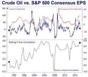
Oil Versus S&P 500 Earnings
The oil market decline will push down headline inflation in the coming months if it stays near these levels. It will lower input costs, which will help margins, and lower gas costs for consumers, which will help consumer spending in other areas, and hurt earnings for energy firms. Even though the US has a much bigger energy sector than ever before, the employment in the oil sector is small. Therefore, it’s still better to have lower oil prices. The big problem with lower oil prices is they often signal the global economy is weakening, so it’s not the windfall everyone hopes for.
The chart below tests the signaling effect of oil. Energy sector earnings move dramatically, but they’re usually a small piece of the pie. Therefore, comparing S&P 500 consensus EPS to oil is all about how company guidance affects analysts’ opinions versus how the economy affects oil prices. S&P 500 firms are global just like oil. The strong dollar hurts international profits and oil prices.
Source: Twitter @Not_Jim_Cramer
The rolling correlation has been mostly high this cycle besides the oil crash in 2014. Even though oil fell from 2014-2015 because of too much supply, it still predicted the ensuing global slowdown in 2015 and 2016. Some say it partially caused the slowdown because many emerging market economies rely on exporting oil. This chart explains why stocks and oil are highly correlated. Oil is volatile, but this record long 12 day decline is still a strong signal that global growth is weakening.
Earnings Estimate Weakness
Earnings estimates have been falling. That justifies the October correction in stocks and the current volatility in November. The good news is firms will have an easier time beating future estimates. The bad news is these estimates are based on poor guidance, so companies would need to be wrong. Firms have been wrong before, but the hawkish Fed, tariffs, the end of the fiscal stimulus’ effects, and slowing global growth are making it more likely growth will surprise to the downside instead of the upside.
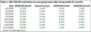
As you can see from the table below, with over 90% of S&P 500 firms reporting Q3 results, year over year EPS growth was an amazing 30.44%.
Source: The Earnings Scout
Q4 faces much tougher comparisons and a slowing economy which explains why estimates are for less than half Q3’s growth rate. Estimates have fallen 2.05% in just 13 days. The estimates for Q1 have much less to fall before hitting negative. They are down 1.69% since October 1st. The biggest recent weakness is in Q2 estimates as they fell 1.01% from last week. A few more declines like that will push growth negative.
The chart below shows stocks rebounded in November even as estimates started to decline. We have seen declining estimates throughout this bull market outside of the increase from the tax cuts. The key is for earnings growth to remain positive. For example, if full year estimates start at 10% and come in at 6%, the bull market should continue.
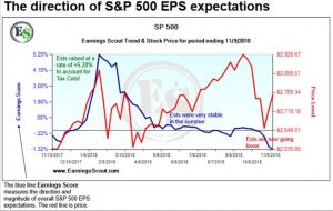
Source: The Earnings Scout
The left chart below shows the 3 month guidance ratio is below 1 as more firms are guiding below the consensus than above it.
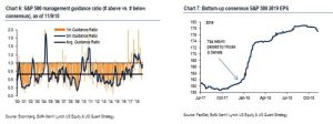
Source: Merrill Lynch
The volatile 1 month ratio is at about 0.5. The chart on the right shows the estimates for 2019 earnings are starting to fall. This increases the forward PE multiple. If S&P 500 firms earn $176 in 2019, the PE ratio is 15.47.
Conclusion
The strong jobless claims don’t tell us a bear market is coming, but the modest weakness in the manufacturing ISM report supports the latest correction in stocks. The 30 year yield minus the 10 year yield could be forecasting a recession soon if the curve steepens. Earnings estimates have been falling sharply. It’s still not enough weakness to justify a bear market, but it does justify the latest volatility in stocks.
Have comments? Join the conversation on Twitter.
Disclaimer: The content on this site is for general informational and entertainment purposes only and should not be construed as financial advice. You agree that any decision you make will be based upon an independent investigation by a certified professional. Please read full disclaimer and privacy policy before reading any of our content.