UPFINA's Mission: The pursuit of truth in finance and economics to form an unbiased view of current events in order to understand human action, its causes and effects. Read about us and our mission here.
Reading Time: 5 minutes
The drug Wall Street is addicted to is debt. Like a drug addict, Wall Street needs an intervention to solve this problem. Usually interventions occur in the form of a deleveraging which is caused by an increase in default rates and rate hikes by the Fed. Although the Fed delayed its habitual rate hikes a few years, it has now started raising rates at a faster clip with guidance for raising the Federal Funds rate 3 times (75 basis points) in 2017.
The chart below shows the level of margin debt as a percentage of the Wilshire 5000:
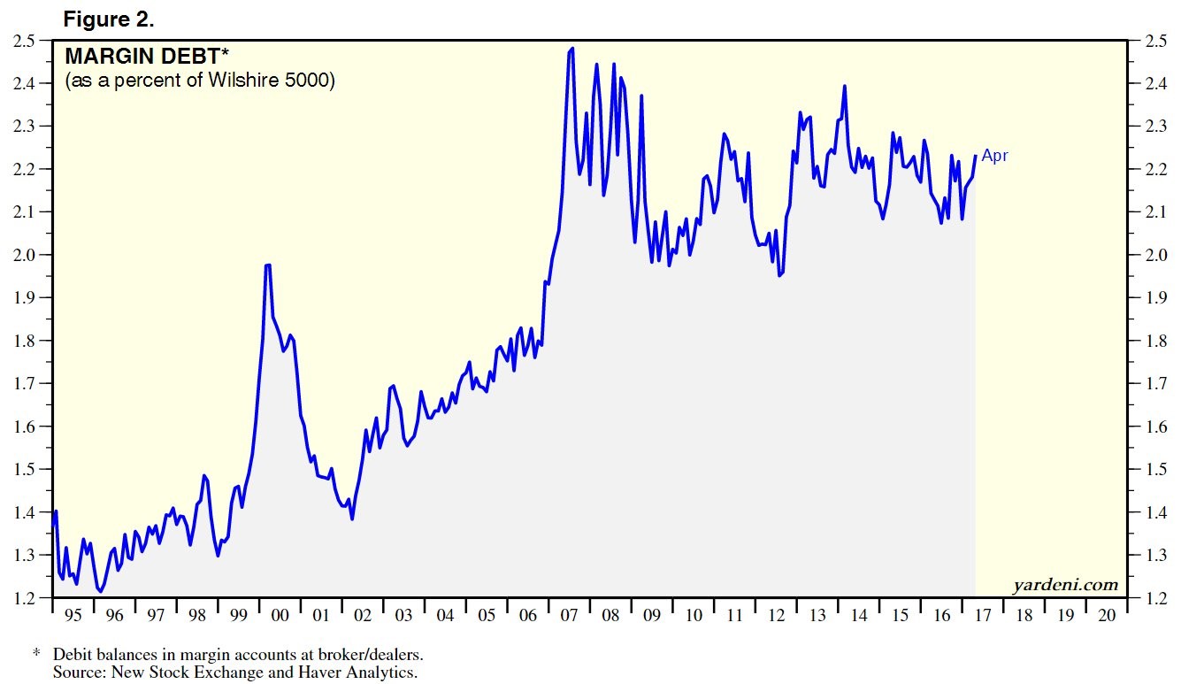
Margin debt is the amount of funds borrowed to be used in stock trades. This measures the speculation in the market. While margin debt can be used to short stocks, this chart looks at the debit balance, so it’s only calculating the stock purchases. That’s great because we’re trying to determine how much long speculation is in the market.
This chart is different from some of the others you’ll see. There is one chart which just shows the total margin debt. That’s a biased chart because margin debt will always move higher due to inflation. Another popular chart compares the margin debt to GDP. This ratio is currently at its all-time high and has been elevated for a few years. Usually that has been an accurate indicator to sell stocks, but it hasn’t worked recently. This comparison considers how expensive the market is versus GDP, but doesn’t show how much the market is being affected by speculation. Comparing margin debt to the market cap of the Wilshire 5000 shows how much enthusiastic speculation is moving the market. As you can see, it’s elevated which is problematic. At any sign of volatility, these overleveraged investors will flee the market which could accelerate a selloff.
The debt isn’t exclusive to speculators’ portfolios. The chart on the left shows the S&P 1500’s net debt compared to EBIDTA. EBITDA is earnings before interest, taxes, depreciation, and amortization. As you can see in the chart, the EBITDA growth and debt growth had been highly correlated until 2014, when earnings peaked.
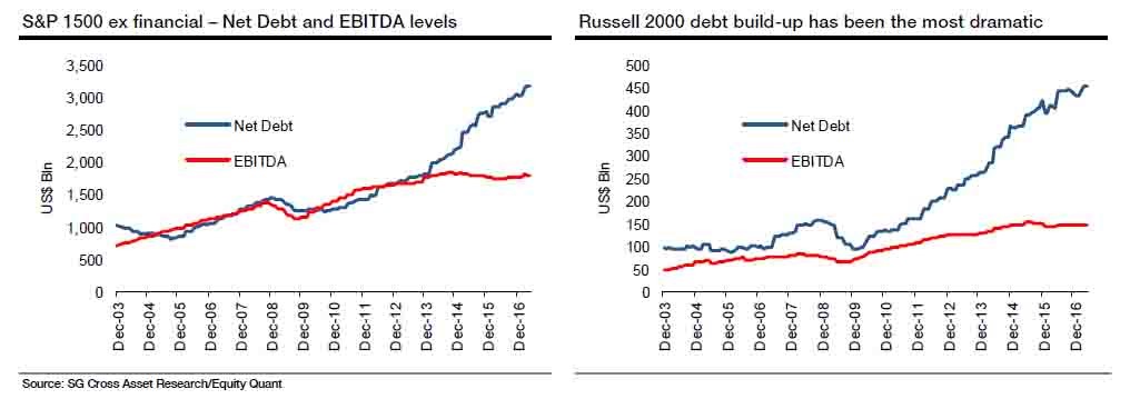
To make up for the decline in cash flow, firms have borrowed money excessively to fund buybacks and dividends. Shareholders are certainly sitting pretty. They are borrowing money to buy stocks to get extra capital gains and those firms are borrowing money to pay them more dividends and buyback stock to push the stock higher. While that situation is excessive, the chart on the right is even worse. As you can see, the Russell 2000, which is the small cap index, has had an even larger build up in debt relative to its EBITDA growth.
As was mentioned earlier, the Fed has begun its tightening cycle. Right on cue with the Fed, the banks have begun tightening their lending standards on commercial real estate loans. That’s in accordance with the decline in commercial and industrial lending.
As you can see from the chart below, the tightening lending standards in the past few quarters mimic the tightening seen in 2000 and 2007.
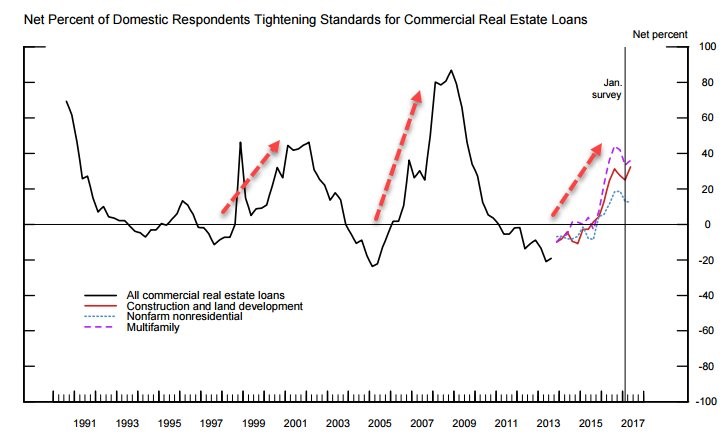
That’s a signal of the end of the business cycle. It will be tough when the small cap firms can’t borrow more money. When their cash flows fall in the next recession, many firms will go bankrupt.
Low interest rates have perpetuated this debt cycle. It’s the reason why it has gotten so large. On the consumer side, the biggest debt bubbles are in auto loans and student loans. The auto loan debt market has grown 43% from the peak in 2007, reaching $1.17 trillion.
The chart below maps out where we are in the default cycle. It’s important to understand that it is a cycle.
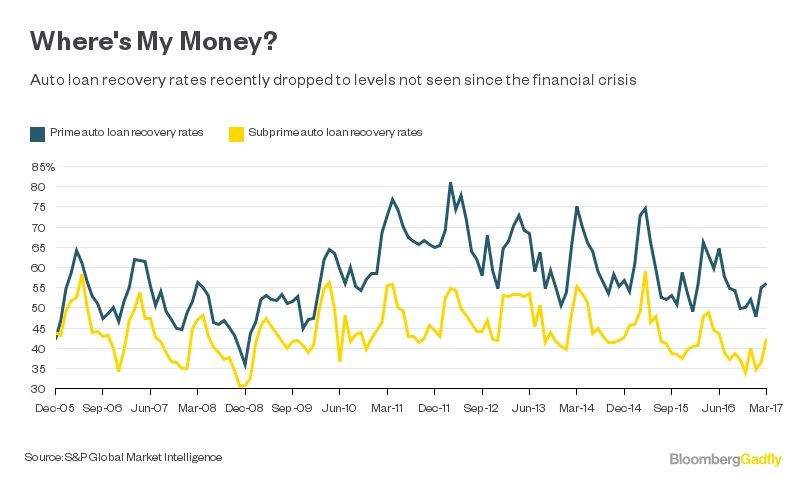
Some optimists think because this cycle has been going on for a few years and the bears have been wrong that it will last forever. This chart throws cold water on that theory. It shows historical prime and subprime recovery rates. Subprime borrowers are borrowers who don’t have great credit scores. They are the borrowers which brought down the housing bubble in 2008. These borrowers have been targeted by auto lenders to meet sales goals.
A recovery rate is the percentage of a loan the lender gets back in the event of a default. Someone who isn’t familiar with this process may think a default means the lender doesn’t get paid back at all, but that’s not true. As you can see, the recovery rates have hovered between 30% and 80%. The prime borrowers have higher recovery rates because they have better credit scores. They’re more responsible and reliable. The disconcerting aspect of this chart is that recovery rates are now hovering near where they were during the 2008 recession. This means the auto loan bubble is near its end.
Amid this excessive risk taking in stocks, the excessive debt small cap firms have, the tightening lending standards on commercial real estate, and the declining recovery rates on auto loans, the stock market is showing no signs of worry.
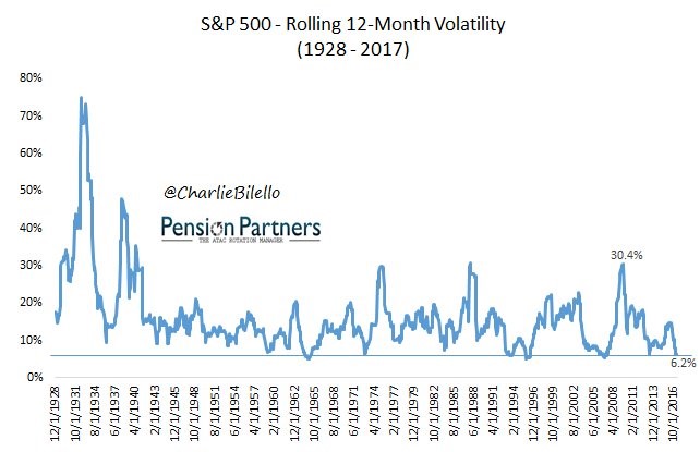
The chart below shows the 12-month rolling average of the volatility in the S&P 500. During the early part of this chart the S&P 500 didn’t have 500 stocks which may explain why volatility was higher. It had only 90 stocks in 1926 and reached 500 in 1957. The fewer the stocks, the easier it is to get wild swings in the index. Either way, this chart is remarkable because of how low the current volatility is. The only lower periods were 1964-65, 1993, 1995-96, and 2006-07.
Conclusion
The stock market isn’t worried about the change in the business cycle, but investors reading this article should be. Expect an increase in volatility over the next 18 months as some of the debt problems start to unravel. It’s best to take a capital preservation approach to investing instead of a capital appreciation approach in these uncertain times. Unlike mainstream thinking, sometimes the best investment is no investment. Cash is your best friend.
Have comments? Join the conversation on Twitter.
Disclaimer: The content on this site is for general informational and entertainment purposes only and should not be construed as financial advice. You agree that any decision you make will be based upon an independent investigation by a certified professional. Please read full disclaimer and privacy policy before reading any of our content.
