UPFINA's Mission: The pursuit of truth in finance and economics to form an unbiased view of current events in order to understand human action, its causes and effects. Read about us and our mission here.
Reading Time: 5 minutes
The number of bears issuing dire warnings increased after the 2008 financial crisis. There’s a mixture of groups in this category. Some of these prognosticators had legitimate fears as it was one of the worst recessions in US history. Others just spread fear by selling books and ads on articles that generate buzz. This business is very easy because you start with the outlook that the economy is about to collapse and fill in the gaps with the most negative charts and stats you can find. The final group of investors are simply doing bad analysis because they get obsessed with some negatives like valuations, while missing key positives like earnings growth and improved trade growth. When you have a mindset that leans negative, everything seems like bad news. We’ve heard some bears say that it seems like the more negative the news is, the more stocks rally. If you’re only focusing on the bad parts, it can seem that way. With 2017 having record earnings and the global economy accelerating, though still tepid by historical measure, it takes an extreme myopia to think this way.
One way to recognize the uniqueness of the 2008 financial crisis is to look at the chart below which shows the historical S&P 500 earnings. The chart uses a logarithmic scale so the changes are depicted equally. As you can see, the 2009 crash in earnings was unique.
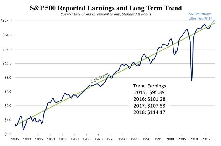
Historical S&P 500 Earnings
There hasn’t been a crash like that since 1935. Recency bias makes it seem like that crash will occur again, but it probably won’t unless there’s a new catalyst for mayhem. No one can predict the future, but recognizing that crashes like the housing bust don’t happen often makes you realize that another one isn’t necessarily around the corner.
The chart above also busts another negative tendency that some investors have. The chart shows earnings grow 6.2% per year on average. That means stocks should hit records often. It’s a trend which has existed for 82 years. Sometimes earnings grow above and below trend, but they usually revert to the trend after a few years. There is a natural tendency to get nervous when stocks hit record highs. It’s especially concerning to investors who hadn’t experienced this for a few years as stocks crashed in the early 2000s and 2008. Record earnings and stock prices beget new records. While profit margins are much higher than average and the stock market is much less volatile than usual, there’s nothing usual about the earnings growth and price appreciation we’ve seen in this bull market.
As we discussed, there is some uniqueness in this market, which has both is positives and negatives. The volatility is unusually low as this year has had a few months with average VIX prices which have broken record lows since 1990. The Ned Davis Research chart below is a great summary of some of the streaks without a correction.
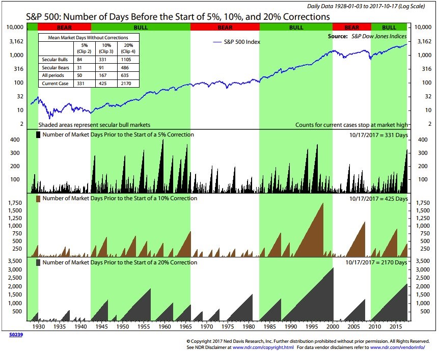
Winning Streaks The S&P 500 Is On
This market doesn’t seem to go down despite some of the negative economic reports and geopolitical issues. Before we look at the streaks, let’s acknowledge that the internet tends to make small stories seem like a big deal. When you go on Twitter and other websites, a small scandal or a one off negative report can make it seem like the world is ending. It’s tough to contextualize events that would normally cause volatility in stocks in other periods because many news stories are now blown out of proportion . One small example of this is how advancements in Doppler radar allow hurricanes in the middle of the ocean to be discovered, while a few decades ago, hurricanes that didn’t come close to land weren’t tracked. As you can see, more information can make the world appear scarier, but it doesn’t mean actual economic results and earnings are worse now than before. By recognizing this new bias, we can correct for it.
Getting into the latest S&P 500 streaks, as you can see from the chart, the streak without a 20% correction is the second longest since 1928. The streak without a 10% correction is also closing in on one of the longest ever. The chart doesn’t show this, but the market is now in the longest streak without a 3% selloff. The max decline in 2017 was 2.8% which is the second smallest ever. It’s difficult to measure what this means. Declines in volatility aren’t inherently bad. The market isn’t like a slinky which expands after it contracts. Proof of this is the mid-1990s which had low volatility streaks that didn’t directly lead to a crash. The best approach to this change in the way the market reacts is to not expect it to continue, but not get too bearish. Only turn bearish if you think stocks are expensive and the economy is about to see a downturn. If not, cautiously ride the wave, while taking profits along the way.
Since we mentioned valuations, let’s take a brief look at them. The table below contextualizes the current multiple of the S&P 500 by taking inflation into account.
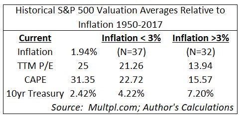
Inflation Adjusted S&P 500 Earnings Multiple
Inflation is critical to stocks as the future earnings are discounted more with a higher cost of capital. The table shows the trailing 12 month PE and the 10 year CAPE earnings multiple aren’t that bloated when you compare them to other periods with low inflation. When inflation increases, we may see multiples shrink, but for now stocks are in a Goldilocks scenario. This is a crude summary of valuations; it doesn’t replace a complete analysis, especially of the stocks you are looking at. What it does show is that stocks usually have higher multiples when inflation is low.
Conclusion
The economy is in a lengthy expansion period which hasn’t been very strong per year. That is one explanation for why stocks haven’t had a 20% correction in a while. The new trend, which started in 2016, of depressed realized volatility is difficult to explain. It’s possible we transition into a new period with average volatility with no rhyme or reason for the change. The important aspects to focus on are earnings growth and valuations. Earnings continue on the 6.2% historical trend line. Even though stocks have high multiples, the multiples look less extreme when you see how stocks have looked in previous periods when inflation was low.
Have comments? Join the conversation on Twitter.
Disclaimer: The content on this site is for general informational and entertainment purposes only and should not be construed as financial advice. You agree that any decision you make will be based upon an independent investigation by a certified professional. Please read full disclaimer and privacy policy before reading any of our content.