UPFINA's Mission: The pursuit of truth in finance and economics to form an unbiased view of current events in order to understand human action, its causes and effects. Read about us and our mission here.
Reading Time: 4 minutes
The advantage of hard economic data over surveys is that it isn’t manipulated. It is raw data which tells you what happened. Data can be manipulated to prove whatever point the creator wants. This makes some people skeptical of seasonal adjustments. A healthy dose of skepticism is fine, but sometimes raw data can be manipulated by a one-time event. The key is to figure out what is a one-time event and what is number fudging. One example of number fudging is when the BEA decided to doubly adjust for seasonality in GDP reports to correct the problem of GDP being weak in the first quarter. It calls this adjustment correcting for residual seasonality. The BEA defines residual seasonality as “lingering seasonality even though the data have already been adjusted to remove seasonal effects.” You can make the argument that the BEA is caving to pressures from those complaining that Q1 is too weak. It’s not objective to start changing the data because you don’t like how it looks.
We have reviewed how all types of data can be skewed; raw data can be affected by one-time events and adjusted data can be changed to make it look better. There is no simple way to say what the truth is with regards to the economic data. There is no tea leaf which will give you the answer of how the economy is doing now, let alone tell you where it is headed. The best process is to look at every report you can get your hands on as well as listening to corporate earnings calls. This may sound like the person on Twitter who said he reads every single annual report a company has released for a potential investment, but it’s not that time consuming. If you use mam.econoday.com, you can look at every economic report that is coming out each day. Most reports are short. If you own a few stocks, you can use what you glean from their earnings reports to get an idea of where the economy is headed. Economics is an art and a science.
One of the better economic reports is the tax withholding information because it is updated quickly and it tells you how much money people/businesses are earning. You’re not going to fake your earnings in an attempt to pay more taxes than you need to. That’s why this information is so valuable. Whenever the Fed tries to collect data on wages, it makes so many adjustments, it’s tough to see what happened. It’s not that adjustments are always bad, but if the Fed makes 10 different adjustments for ages of the labor force, seasonality, and whether the worker is part of management, and one of these changes is wrong, it can mess with the whole data set. If the raw information is off in the tax withholding information, it’s very easy to see what may have caused the change. It’s most likely a big economic event which is easy to see in plain view. The one issue with this is that you don’t know what the metric would have been had that event not occurred.
As you can see from the chart below, the 2017 tax withholdings in every month except February were up from 2016.
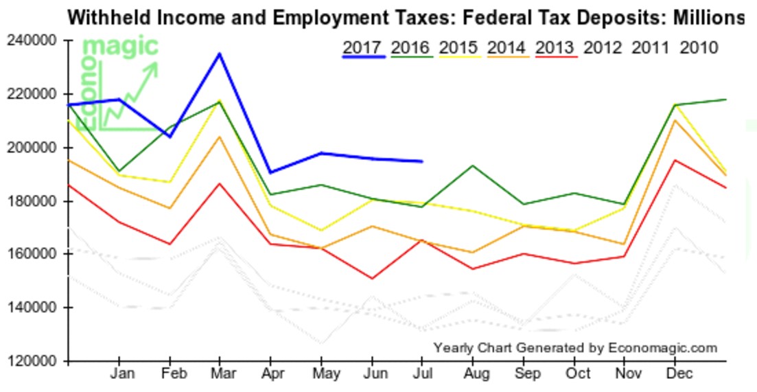
Tax Withholdings Up To July 2017
In July, there was a 9.7% increase from last year. That’s accelerated growth as last month saw 8.2% growth. Because there weren’t any major tax changes, this data shows that earnings were up 9.7%. That doesn’t mean wages were up that much because the labor force also increased. This information gives support for the stock market which is up over 10% this year. It gives you an optimistic basis to draw from when you look at various economic reports.
Now it’s time to look at an economic indicator which is smartly adjusted to show you how you can gain new perspectives from data sets. The chart below shows the personal income growth.
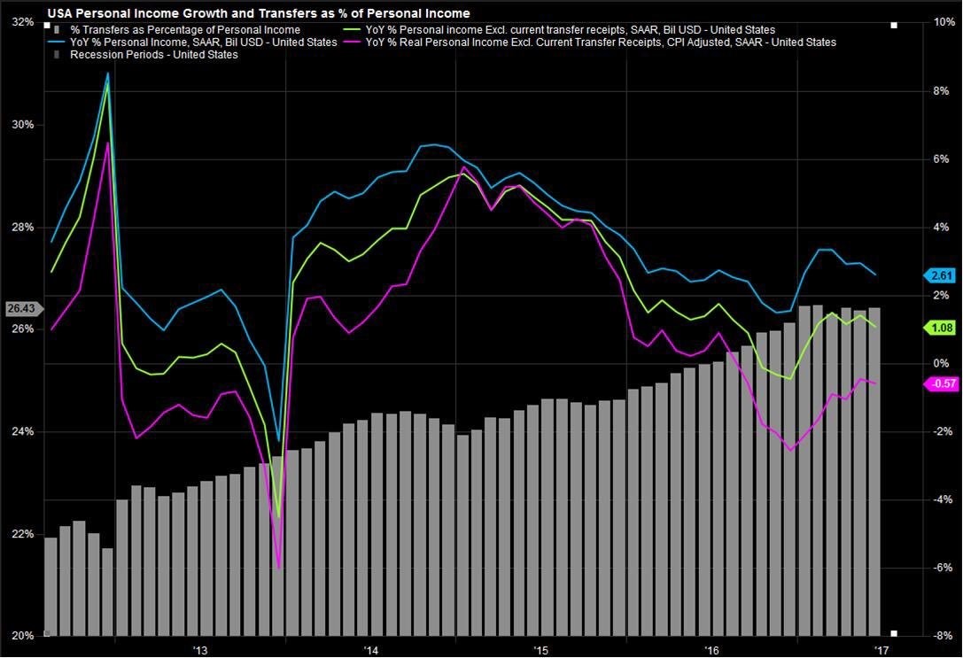
Personal Income Growth Adjusted For Transfer Payments
The chart then breaks down personal income growth by including transfer payments and excluding transfer payments. A transfer payment is money given to individuals from the government without anything given back. It’s a benefit such as unemployment insurance. As you can see from the chart below, the blue line is the normal year over year personal income growth stat. As you can see, the 2.61% growth rate is much weaker than the tax withholdings growth explaining why retail spending isn’t robust. The most interesting part of the chart is the green line which shows the income growth without transfer payments. This is only up 1.08% year over year.
The grey bars show how much the transfer payments as a percentage of personal income have been growing for the past few years. In 2012, transfer payments were about 22% of income. Now they are 26.43% of income. One must wonder when the tipping point is as the government won’t be able to afford to grow transfer payments much higher. Already only about half of people pay taxes. This transfer payment growth has occurred in a tepid economic recovery. In a downturn, this would skyrocket higher. It’s very likely that the deficits in the next recession will be the largest in history in terms of the percentage of GDP.
The last tidbit of information to top off this very useful chart is that when you include inflation, as measured by the CPI, personal income growth is negative in 2017 and was negative in 2013. That’s not indicative of a strong recovery.
Conclusion
This article aimed to show how you must look at all types of data when doing economic analysis. We looked at the raw data from the tax withholdings and the seasonally adjusted personal income data which was broken down by source and adjusted for inflation to explain how data can be analyzed. The best way to do your own analysis is to look at everything to get a broad scope of where the economy is. This will allow you to spot numbers which don’t follow the trend. Using the historical accuracy of economic reports is an example of back testing them to get an idea of their predictive value. The two charts in this article are both useful to measure the health of the consumer. The truth is probably somewhere in the middle as we aren’t in a recession, but consumer spending growth isn’t accelerating.
Have comments? Join the conversation on Twitter.
Disclaimer: The content on this site is for general informational and entertainment purposes only and should not be construed as financial advice. You agree that any decision you make will be based upon an independent investigation by a certified professional. Please read full disclaimer and privacy policy before reading any of our content.