UPFINA's Mission: The pursuit of truth in finance and economics to form an unbiased view of current events in order to understand human action, its causes and effects. Read about us and our mission here.
Reading Time: 5 minutes
The focus of UPFINA is to be a website dedicated to showing you where investing arguments can go wrong. Our only purpose is to be objective in all regards and to understand the progression of history and economics with accuracy. Every investment thesis has a few fundamental pillars that are integral to the success of the investment. However, if one of the pillars is incorrect, there’s greater risk that your investment will experience subpar risk adjusted returns. Whenever you see a chart or argument that looks too obvious, you need to question it further.
The most overlooked aspect of any investment framework are preconceived notions, otherwise known as absolute truths, that we perceive as eternal, unwavering and unquestionable. It is very difficult to question almost every belief you understand to be true, but it can be extremely beneficial. The more investment experience you have, the sooner you realize that you are not infallible when it comes to investing. As a matter of fact, no one is infallible, which is why we state that you should listen to all, but follow none. The more you question everything, including yourself, the better your odds of success.
Mean Reversions Skew Our Timing
We find that the mean reversion argument overlooks the most important aspect in investing – timing. As a result, if your investment pillar is mean reversion, that is not a good reason by itself. For example, those who claim profit margins mean revert even though they are cyclical have been wrong for a while. That’s not to say mean reversions don’t occur; of course, they do. However, reality is a bit more complicated. Saying a metric is cyclical means it goes up and down with the economy, but that in itself does not prove that everything has to mean revert. Claiming a metric mean reverts is very rigid because it rules out even the possibility of the metric staying where it is for longer than expected because of fundamental reasons. The only way the mean changes is if the metric has significantly diverged from the average for a prolonged period of time that the average moves. If you’re looking at data which covers decades, be prepared to be wrong for years if you think a metric mean reverts when it doesn’t. Therefore, make sure your your investment pillars (thesis) are founded on fundamentals, rather than the belief that something has to mean revert.
Are Commodities Poised To Rally?
The chart below is an example of a one metric some claim will mean revert. It compares the Goldman Sachs Commodity Index with the S&P 500.

Source: Bloomberg
The index is at the lowest point since at least 1970. If the chart were to mean revert, the commodity index would outperform the S&P 500 for an extended period of time. We are not stating that this is unlikely to happen. We are making an argument that if your only investment thesis is that something will mean revert, with no other investment pillars, then this could be damaging to your risk adjusted returns.
Also, comparing the Goldman Sachs Commodity Index to the S&P 500 is not correct because it compares two differently constructed indexes. The commodities index is a total return index while the S&P 500 is just a price index. The chart below from Haver Analytics does a better job of capturing the relationship between the two metrics because it compares the commodity index’s total return with the S&P 500’s total return.
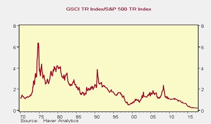
Source: Haver Analytics
Since the S&P 500’s total return is higher than the price index, the red line in the chart shows a lower ratio. This chart doesn’t look like something that mean reverts. It looks like a secular decline. Another point to consider is that this chart only dates back to the 1970s. This range of dates could make the false impressions that commodities need to get back to the 1970s level to mean revert. However that time period was an anomaly historically rather than the norm so we need to be careful in stating that a time period like the 1970s has to happen again. While it’s likely to happen, it can take much longer than we anticipate if the only clue we have to follow is mean reversion.
Another argument you could make is that the total return chart is not an apples to apples comparison because equities build up cash flows while commodities do not. Therefore, let’s look at the prices compared index in the Palisade Capital chart below.
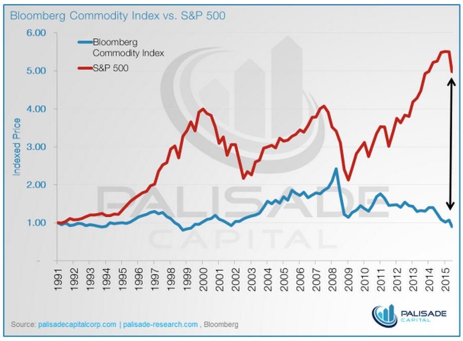
Source: Palisade Capital
The commodities index has underperformed stocks since 1991. The gap is large and there’s no guarantee it will shrink imminently. This metric demonstrates another reason why you should be careful with the mean reversion argument. Timing is critical in investing.
Corporate Debt-to-GDP
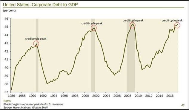
The chart below is another example that demonstrates a commonly misused index, corporate debt-to-GDP, which suggests a mean reversion is about to take place.
Source: Haver Analytics
The corporate debt to GDP ratio looks very high, however it may not be accurate to compare corporations to domestic GDP since American companies have expanded their businesses abroad. To get a more accurate picture, it’s better to look at the leverage ratios and the ability of firms to service their debt.
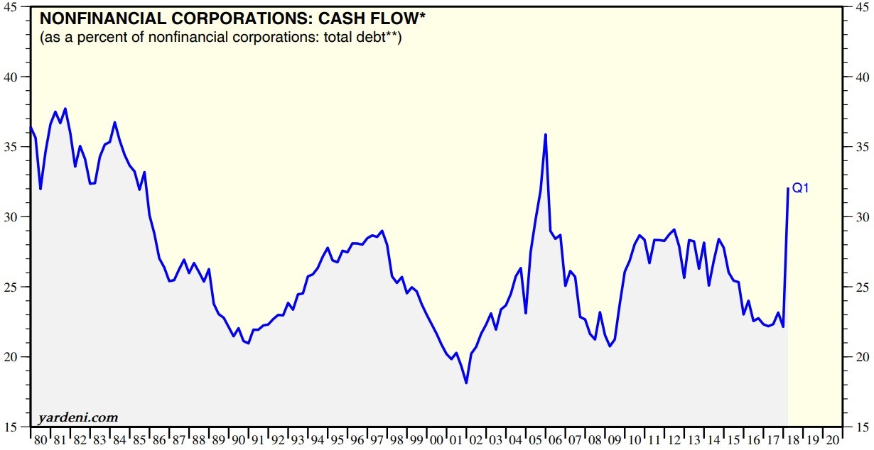
The Yardeni chart below shows an alternate viewpoint of corporate leverage by showing non-financial corporate cash flow as a percent of total debt.
Source: Yardeni
The leverage ratio has improved in Q1 2018 because cash flows have increased since the tax cuts were implemented. The situation was problematic in 2017. Low interest rates promoted the issuing of more debt. While 2018 has witnessed rising interest rates which increases the cost to service debt, the increasing profits have more than offset this issue.
The FRED chart below shows another reason why the gross corporate debt to US GDP metric may be incorrect.
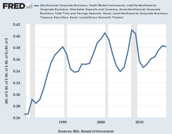
Source: FRED
The original chart compares the gross corporate debt to GDP instead of the net debt to GDP. The FRED chart above corrects for that error. The current situation looks much less daunting. This ignores the point we made earlier about how US based firms have grown into international behemoths which shouldn’t be compared to the US GDP.
Conclusion
Once again, the goal of this article is for you to question your investment thesis, to ensure that your investment framework is logically sound and does not rely on false premises. While aspects of the economy certainly mean revert, using mean reversion as an investment pillar can have a catastrophic impact on your investment returns. Just because the divergence from the mean is large does not give assurance that there will be a mean reversion imminently. Remember, markets can stay irrational longer than you can stay solvent.
Have comments? Join the conversation on Twitter.
Disclaimer: The content on this site is for general informational and entertainment purposes only and should not be construed as financial advice. You agree that any decision you make will be based upon an independent investigation by a certified professional. Please read full disclaimer and privacy policy before reading any of our content.