UPFINA's Mission: The pursuit of truth in finance and economics to form an unbiased view of current events in order to understand human action, its causes and effects. Read about us and our mission here.
Reading Time: 5 minutes
Let’s be clear, there are valuation metrics, principally the CAPE ratio, which show equity prices in June 2018 are expensive. However, that doesn’t mean you need to be mislead by other false bearish narratives. Stocks can have low long term returns and there can also be wrong bearish arguments. We care about the most accurate arguments which is why as the data evolves and presents new facts, our view of the world evolves with it. If you take a snapshot view of the world and then base all assumptions on that view, without being cognizant of changing dynamics and information, that will likely lead to catastrophic investment returns.
Are Equity Holdings Elevated?
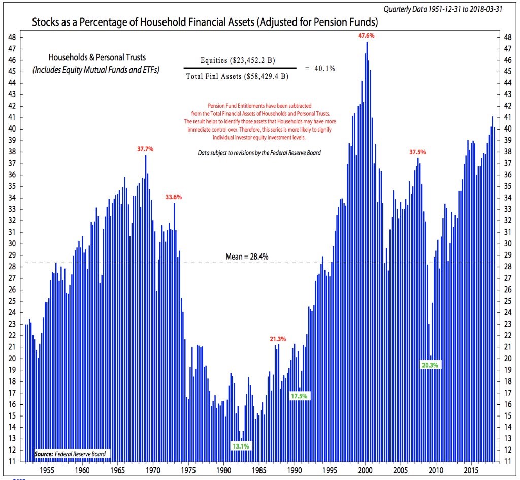
One of the most popular bearish charts is seen below. This chart shows stocks as a percentage of total household financial assets.
Source: Ned Davis Research
The theory is when this ratio is high, it’s a bad time to buy stocks because the ‘dumb money’ is all in. This percentage can go up because investors are buying or simply because prices have soared. Both reasons can be good justifications to sell. The current percentage is bearish because it is the 2nd highest since 1950. Being compared to previous peaks such as the mid-1960s and 2007 isn’t good.
Usually charts have their numbers right; the problem is there usually is a missing figure which objective analysis can only find. Healthy skepticism can help solve this puzzle. The chart below created by Econompic does an amazing job of poking a hole in the argument presented in the chart above. This chart examines two categories: non-corporate equity and corporate equities plus mutual funds.

Source Twitter: @Econompic
As you can see, non-corporate equity is down significantly while corporate equities and mutual funds are up. The combined total percentage looks less extreme than the previous chart.
Decline In Dynamism Means Less Non-Corporate Equity
Previously, in The US Is In Secular Economic Decline, we discussed the decline in sole proprietorships, partnerships and overall decline in business creation in America as the economy has become less dynamic. We wouldn’t say the high valuations are justified by the decline in small business and rise of big businesses, but they certainly are explained. Americans’ financial assets aren’t at extreme levels since the percentage has been above 60 for many years since 1948. There has been a shift in assets. You need to believe a revival in business creation will occur to believe a shift will occur in equity ownership. If that doesn’t happen, the first chart and the blue line in the 2nd chart will be elevated for many years to come. It will shift as a result of price changes, but won’t act as a catalyst for a crash like the first chart implies.
Greater Access To The Markets Promotes Investing
Another catalyst besides the weakness in business creation is the invention of 401K funds. The law which made retirement investing tax free was passed in 1978. Since these 401K plans were technically a loophole in the tax law, it took until the 1980s for them to be popularized. America has gone through a financial revolution in the past 50 years. First retirement accounts promoted more investing for retirement and then ETFs allowed everyone to get access to the whole market for a low fee.
It’s simply amazing to see ETFs and robo advisors dropping their fees by a few basis points because the prior generation had to pay much higher fees to a manager and the one before that didn’t have access to tax fee retirement investing. Life was completely different in the first half of the 20th century as the life expectancy was much lower. You can say the advancement in personal finance has been necessary to pay for longer retirements and increasing medical costs.
Millennials Not Participating
We’re painting a picture of financial advancement for Americans who can invest in lower cost funds. They can also more easily research their investments for free on the internet. However, these advantages don’t matter at all if you don’t have any money. This isn’t a doom and gloom narrative; it’s simply the reality of wealth inequality. The biggest issue with the current form of wealth inequality is it is generational.
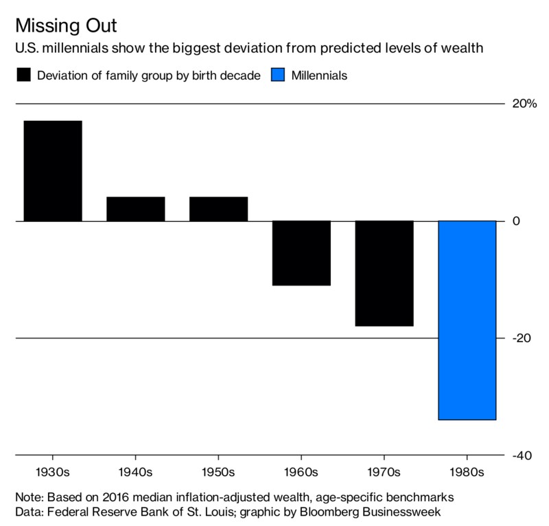
The Bloomberg chart below shows the predicted levels of wealth for people born in each generation.
Source: Bloomberg
The deviation switches to negative in the 1960s and gets extremely negative in the 1980s which is when many millennials were born. It’s not good to see such a negative trend and it’s terrible that it’s the youngest people because in the future there won’t be anyone born in the 1950s who will have wealth to spend and invest which drives the economy. To give even more perspective on the generational wealth gap, Americans between the ages of 30 and 39 have accumulated 46% less wealth on average in 2017 than those in the same age bracket had accumulated in 2007.
Is A Correction Coming?
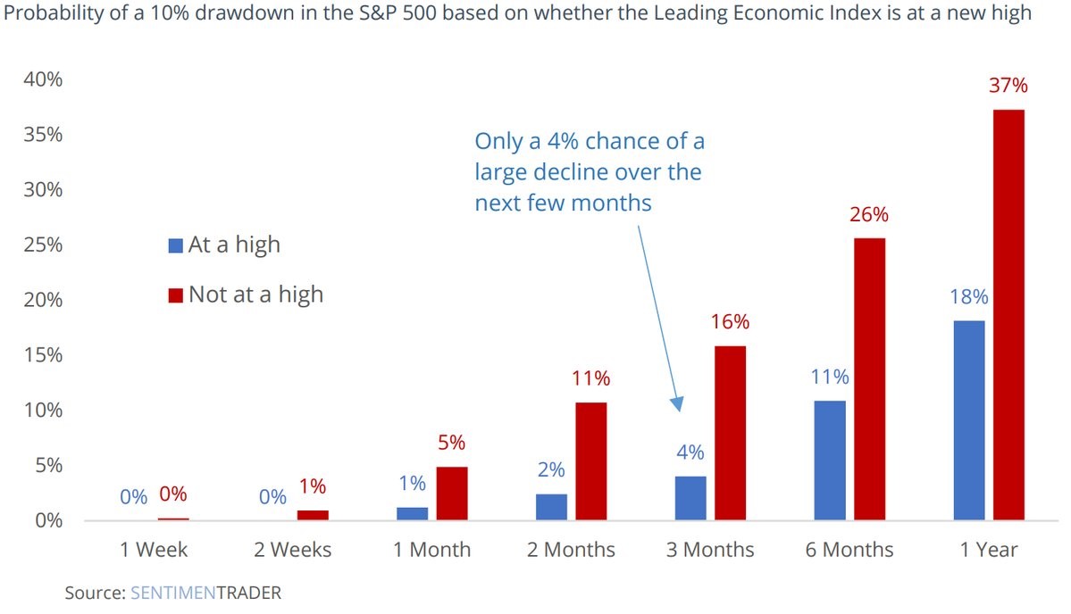
If you’re an investor looking at the first chart in this post, you want to know when the next correction will be. Since that chart didn’t help, we have one that will. The Sentiment Trader chart shows the probability of a 10% correction in various time periods based on if the leading indicators are at an all-time high.
Source: Sentiment Trader
The leading indicators peaked at 152.42 on February 2nd, 2018. As of June 15th, they were at 150.08. As of that report, we must use the red bars which have higher chances of a correction. If the leading index goes up slightly to a new high, we shift to the blue bars which have a lower chance of a 10% decline.
Is A Recession Coming?
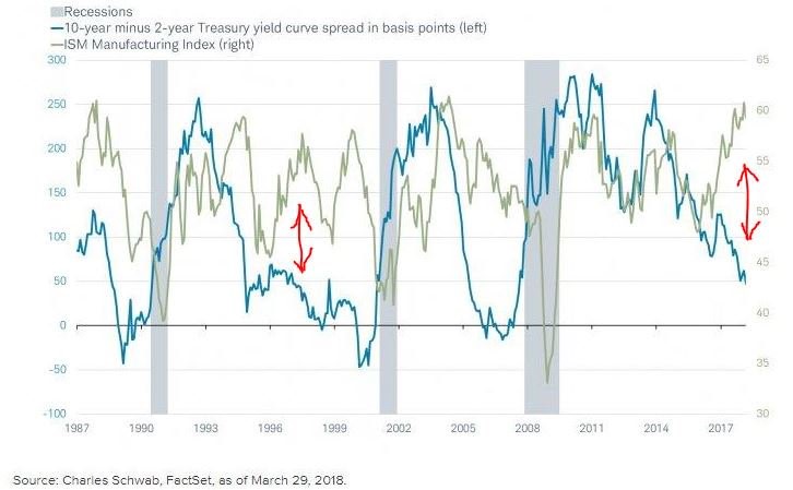
The chart below shows an interesting perspective on whether the next yield curve inversion will signal a recession.
Source: Charles Schwab FactSet
In June 1998, the curve inverted with a high manufacturing ISM. That was one scenario where the curve was wrong in being used as a timely recession indicator since there wasn’t a recession until 2001. The current manufacturing ISM is high. If it stays that way and the curve inverts later this year, we have the potential to test this thesis. With such strong economic growth in 2018, it’s difficult to see a recession coming soon, but the 36 basis point difference between the 10 year and 2 year treasury yield has many investors worried about one happening in 2020.
Conclusion
Americans have more stocks and mutual funds as a percentage of their assets since 1950 besides the tech bubble period. However, the shift from non-corporate equity to stocks and mutual funds makes this trend look worse than it is. Millennials have much less wealth than those in the silent generation and baby boomers because of student debt and low real wage growth. If the leading indicators increase slightly, there will be a very low chance of a 10% correction in the near term. The current strong economic growth doesn’t jive with a recession, but the yield curve is near giving off a warning signal to sell stocks.
Have comments? Join the conversation on Twitter.
Disclaimer: The content on this site is for general informational and entertainment purposes only and should not be construed as financial advice. You agree that any decision you make will be based upon an independent investigation by a certified professional. Please read full disclaimer and privacy policy before reading any of our content.