UPFINA's Mission: The pursuit of truth in finance and economics to form an unbiased view of current events in order to understand human action, its causes and effects. Read about us and our mission here.
Reading Time: 5 minutes
Recency bias can skew investors’ perspective of reality. That applies to both those who are perma bulls and bears. The 2008 financial crisis was so bad that some perma bears believe that the next crisis will be bigger. That’s possible, but is it probable? In the past we reviewed the probability of whether the next crisis will be as bad. Also, it’s important to point out that the S&P 500 fell by about 50% in the past 2 recessions. For about the first 3 years of this expansion, the S&P 500 was down from its peak in 2000. That’s over a decade of no gains. It took the Nasdaq until 2016 for it to hit a new record high. That’s about 16 years of no gains. The reality is poor performance shouldn’t make you bearish because it might mean stocks are cheap.
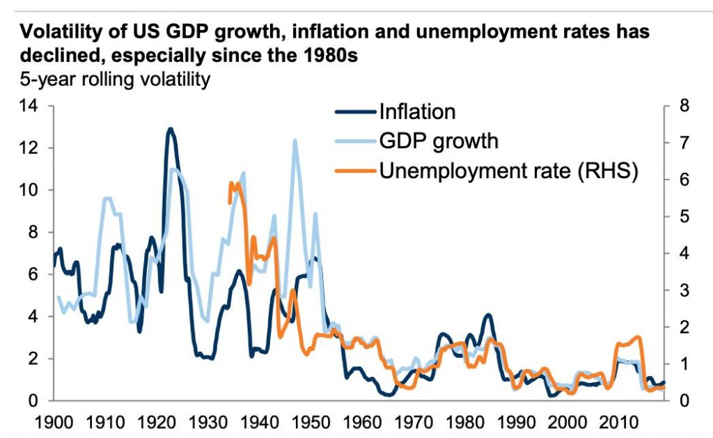
It’s also notable that this expansion has been consistent. It has been weak, but it hasn’t been volatile. We’ve had a consistently declining unemployment rate without a spike in inflation. As you can see from the chart below, the steadiness of GDP growth, inflation, and unemployment has been amazing in the past few years.
Somehow during this placid period, there are many investors still preaching the economy is highly uncertain and a depression is waiting around the corner. Those claims don’t hold up when you do an objective analysis of the data. As it concerns perma bulls, it doesn’t mean that this low volatility trend will continue in perpetuity, either. All we can do is objectively examine all the data and derive the highest probability outcome, at this time, using current data.
Mildly Hawkish Minutes
We said the July Fed Minutes were mildly hawkish because the Fed stuck with the notion that the July cut was a mid-cycle adjustment. It was referred to as a “recalibration.” It also was hawkish because the number of cuts priced in for the rest of 2019 fell. The Fed funds futures market declined from showing a 54.9% chance of 3 more cuts by the end of the year to a 31.4% chance in the past couple days.
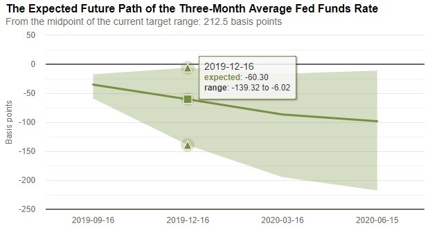
As you can see from the chart below, the Fed funds rate is expected to be 60 basis points lower by the December meeting.
It’s not like the market saw the Minutes and decided zero cuts are coming this year. The expected rate path simply moved modestly higher. The hawkishness caused the 10 year 2 year spread to invert again. Since the curve already gave off the recession warning earlier this week, any flattening should be thought of as good news because it means the curve is far from the steepening that typically occurs during recessions.
It’s notable that these Minutes are from a meeting that occurred a couple days before the latest tariffs were announced alongside more data signaling a slowdown. The Fed might have been more dovish if it knew about that new policy and had the most recent data. Fed chair Powell has a chance to correct the record in his Jackson Hole speech this Friday.
Every time the Fed provides guidance, there is a term that summarizes the latest stance. The Fed has been known to torture language by making very subtle changes which can confuse investors. The term of the July Minutes was ‘pre-set course.’ The Minutes stated, “In their discussion of the outlook for monetary policy beyond this meeting, participants generally favored an approach in which policy would be guided by incoming information and its implications for the economic outlook and that avoided any appearance of following a pre-set course.”
By saying it isn’t on a pre-set course, the Fed can support the notion that rate cuts are adjustments, while also remaining flexible to more rate cuts. That is creative use of language. The takeaway here is the Fed didn’t assure the market it will cut rates which is a big difference from expectations. The market is way past flexibility. It’s pricing in a new cut cycle.
Very Good Existing Home Sales
Existing home sales don’t affect GDP growth. However, this report is the most important measurement of the housing market (much larger than new home sales). It’s one of the few recent positive hard data housing reports. Lower rates are finally helping housing. This report had the first yearly existing home sales growth since February. Specifically, existing home sales in July were 5.42 million which beat estimates for 5.385 million and the June reading of 5.29 million. That’s 2.5% monthly growth and 0.6% yearly growth. As you can see from the top right chart, single family home sales were up 1% yearly to 4.84 million. Condo sales were flat at 580,000.
The existing home supply fell 1.6% monthly to 1.89 million. The months of supply fell from 4.4 to 4.2. The supply in June was the highest since September 2018. Median home sale prices were up 4.3% yearly to $280,800. 32% of sales were to first time buyers which is down from 35% in June. On average properties were on the market for 2 more days than June as they were there for 29 days. All-cash sales increased from 16% to 19%. Just like the housing market index, the West was the strongest region as it was up in the high single digits to 1.18 million. The South and the Midwest were up in the low single digits, while sales fell in the low single digits in the Northeast.
Big Negative Employment Revision
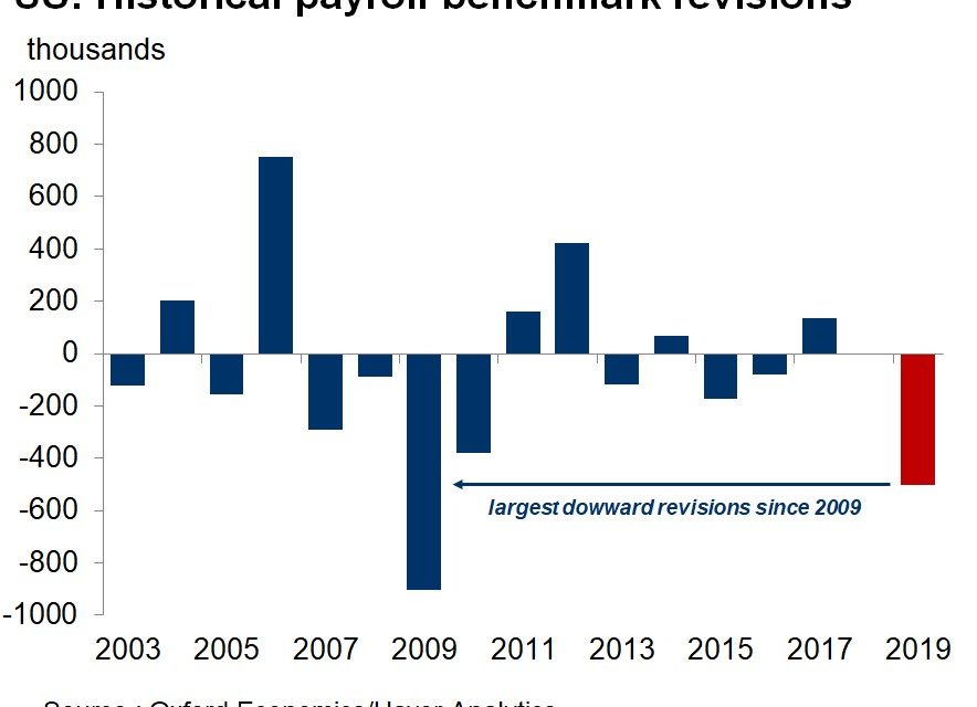
There are often sharp employment revisions which is why the first reading can’t be fully relied upon. The latest revision was horrible. Job creation was revised lower by 501,000 making this the worst revision since 2009. Retail trade created 146,400 less jobs. Leisure and hospitality created 175,000 less jobs. Professional and business created 163,000 less jobs. It’s not that job growth fell. It’s that these jobs were never created and the original calculation was wrong.
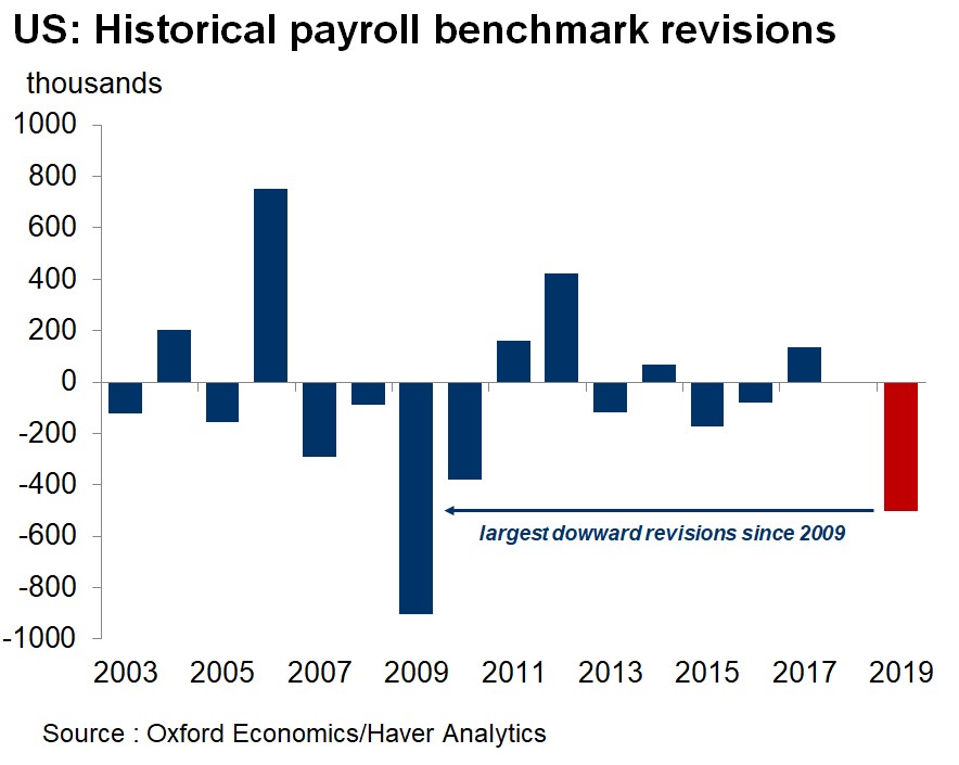
This March 2019 preliminary benchmark will get its final revisions published in January 2020. It takes that long to see how the labor market really did. The chart below shows the revision to the yearly change in the number of jobs.
As you can see, virtually the entire bump in 2018 was taken away. This revision makes the Trump tax cuts look worse because there wasn’t much of a bounce in job creation after the legislation was passed. 2018 was a stabilization period rather than a boost higher which makes sense since the labor market is nearly full. The latest change in jobs looks even worse now.
Conclusion
The economy has been stable which goes against what the perma bears claim. The Fed is open to cutting rates, but didn’t guide for any cuts which caused the yield curve to flatten. The market expects a couple more cuts this year. The July existing home sales report was very good. The March 2019 labor market revision was terrible. The labor market is creating less jobs than expected which is in tune with the fact that the labor market is nearly full.
Have comments? Join the conversation on Twitter.
Disclaimer: The content on this site is for general informational and entertainment purposes only and should not be construed as financial advice. You agree that any decision you make will be based upon an independent investigation by a certified professional. Please read full disclaimer and privacy policy before reading any of our content.

