UPFINA's Mission: The pursuit of truth in finance and economics to form an unbiased view of current events in order to understand human action, its causes and effects. Read about us and our mission here.
Reading Time: 5 minutes
This article is going to review a few misnomers investors have. Before being able to analyze the data, you need to understand what the metrics mean. For example, if you sold stocks because earnings estimates were falling, it could be a mistake because earnings estimates usually fall. It’s only a problem when estimates fall more than average and growth is negative. There have even been years were earnings fell and stocks rallied and the reverse of that.
The Fed’s Balance Sheet Shouldn’t Inspire Fear
It’s possible that the algorithms caused stocks to fall after Powell’s comment that the Fed’s balance sheet shrinkage was on auto pilot. It’s either that or investors were panicking at anything that could be construed as hawkish. One of the most popular charts by market cynics who believe the fundamentals don’t matter and only central bank policy matters is the one that compares the S&P 500 to the Fed’s balance sheet.
As you can see from the chart below, the stock market and Fed balance sheet rose in tandem at the start of the bull market.
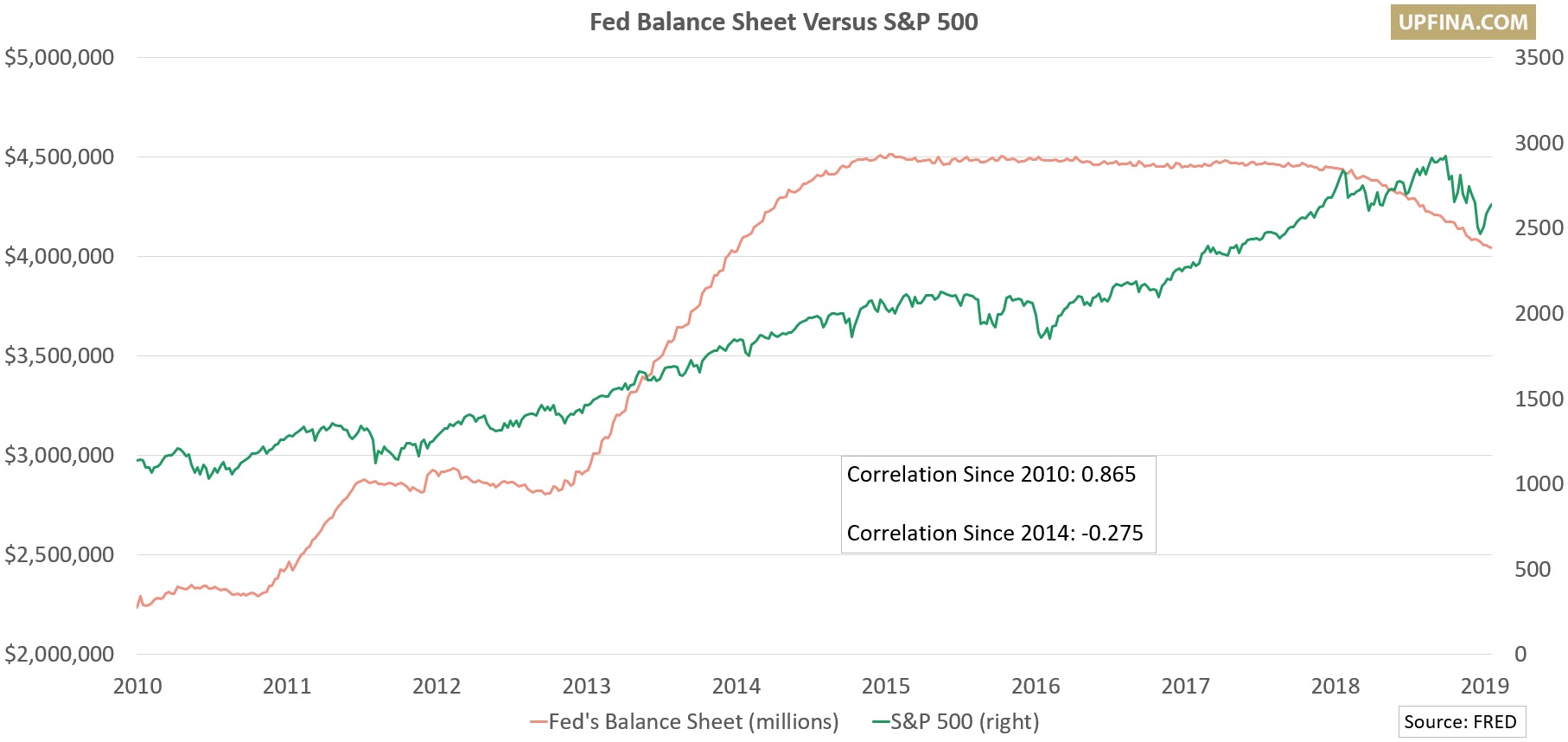
The Fed’s balance sheet stopped increasing in 2014. Since the stock market didn’t do well in 2015 and early 2016 because of the economic slowdown, the cynics rejoiced that their thesis was true. However, that was temporary as the unwind started in October 2017, but the stock market kept rallying. Specifically, the correlation was 0.865 since 2010 and -0.275 since 2014.
The argument then changed to include all central bank balance sheets. That’s moving the goal post. More importantly, you can pick any two metrics that move up and claim one causes the other. The simple reality is stocks tend to move up over time in nominal terms because earnings increase. Valuations vacillate. You are more likely to make a profit in real terms over the long haul if you buy when valuations are cheap than if you buy when valuations are expensive. U.S. stocks have had great returns historically, way before QE was enacted. The conclusion here is that the Fed’s balance sheet shrinkage shouldn’t make you bearish. Look at earnings and economic momentum to determine your positioning.
ECB Not About To Do Another Round Of QE
Many cynics claimed the Fed and ECB would never end QE. When, they were proven wrong, the cynics claimed another round of QE was coming at the first sign of a slowdown. However, the chart below shows European economic growth has waned while the ECB’s balance sheet is peaking. It’s possible this policy will change when a new ECB chair takes the helm in October, but it’s unlikely.
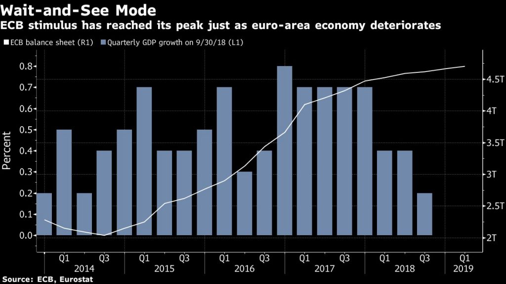
Policy makers probably don’t see the balance sheet as a useful tool to combat the slowdown. They can’t fully admit that because then their years of QE will look foolish. The ECB’s QE was much more aggressive than the Fed’s as it bought corporate bonds. Plus, its purchases of Italian government bonds were very important as the country has high debt and has an unstable banking system. One of the issues with understanding QE is in the chart’s title. It calls the ECB’s balance sheet a stimulus. What is a stimulus that doesn’t stimulate growth? To be fair, the ECB isn’t in a good situation because it hasn’t raised rates this cycle and a few economies such as Italy are facing a recession. Tightening during a slowdown isn’t a great idea.
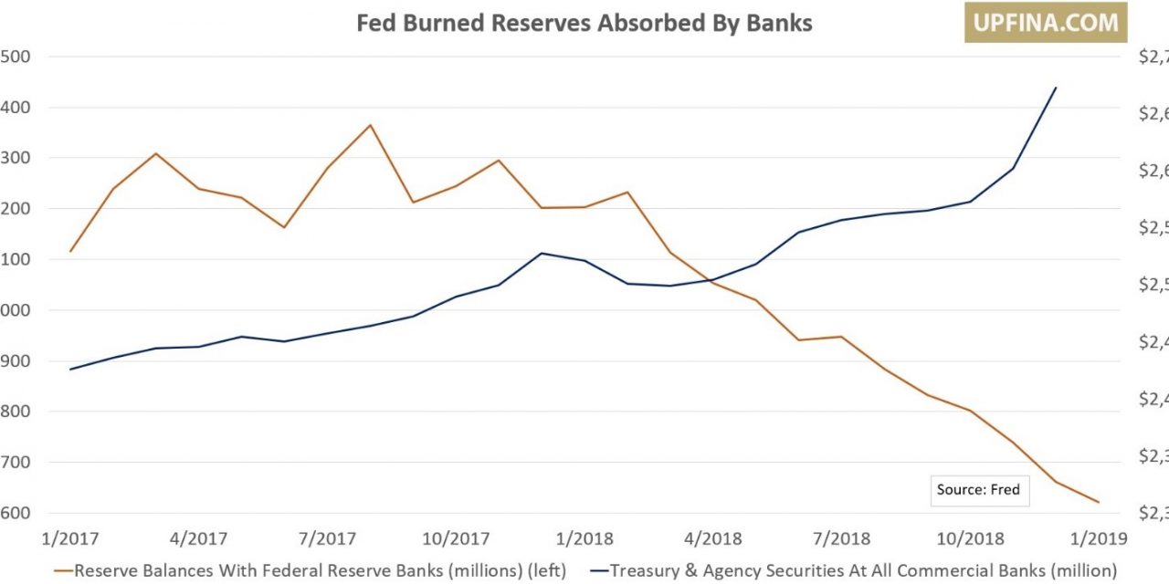
QT Not Doing Much
The chart below is the best at explaining this QT (quantitative tightening) misnomer.
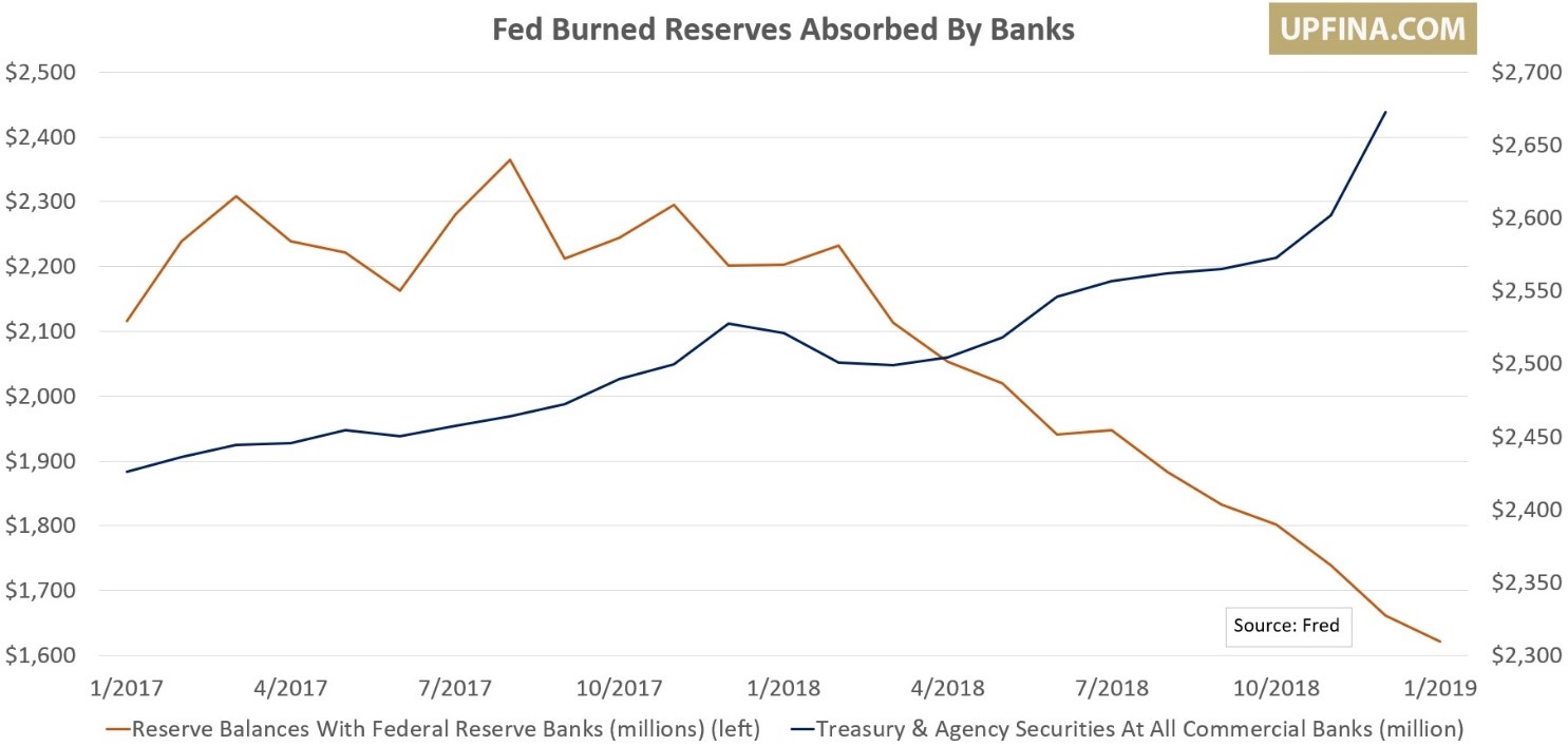
The Fed’s balance sheet is declining while the banks’ holdings of government securities are increasing. The banks were forced to hold more government securities because of regulations, so the supply has been sopped up. Even if you believe QE (quantitative easing) created an asset bubble and QT will prick the bubble, this shows there isn’t much of an effect from QT. This eliminates the bearish thesis.
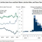
Jobless Claims Misnomer
Jobless claims are 199,000 which is the lowest since November 1969. When you consider the growth in the labor market, the jobless claims are by far the lowest in history. That doesn’t make sense because the prime age labor force participation rate isn’t as high as it was last cycle let alone during the 1990s when the labor market was the fullest. That difference is because the jobless claims are being suppressed. It’s tougher to file unemployment claims than in past decades because the laws have changed.
As the chart below shows, the percentage of continuing unemployment claims as a share of the unemployed has fallen in the past few decades. That’s not to say that the labor market isn’t strong; it’s just not the strongest ever. Furthermore, you can still use this metric to review the labor market. However, comparing it to past decades is comparing apples to oranges.
Not As Many Entry Level Homes Built
Even though the housing market has been weak, especially in the last two months of 2018, there is a supply problem. You would think that weakness in price growth and sales declines would be caused by too much supply and not enough demand. However, there actually isn’t enough supply of entry level housing.
The chart below illustrates this issue perfectly by comparing the prices of median existing homes and median new homes.
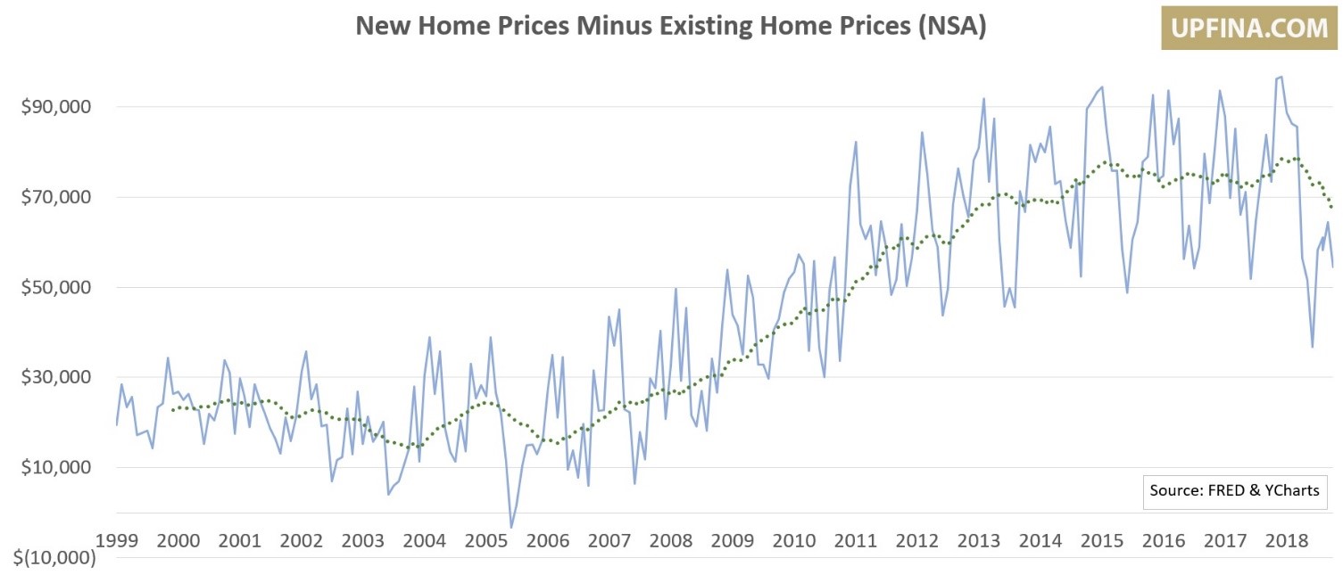
The dotted line is the 1 year moving average. In the 2000s, new homes cost about $20,000 more than existing homes. During this cycle, the difference has increased. It has been above $70,000 for the past few years as homebuilders have focused on the high end market. Housing starts have been low this cycle. Not enough entry level houses being built is pushing millennials to rent more. The good news is the gap has been falling in the past few quarters. It still has a long way to go to back to where it was before the cycle started.
Conclusion
Central banks aren’t the only factor that affect equity prices. As it relates to the US, QE and QT hasn’t created a massive bubble that’s about to implode. While there may certainly be negative effects from both QE and QT on markets and economies, these effects are more nuanced and unclear in real time. This doesn’t mean that mistakes in monetary policy weren’t made. For instance, holding short-term interest rates lower for longer skewed economies to a much greater degree than the effects of QE and QT. QE in Europe on the other hand, which was used to purchase corporate bonds, had a significant impact in creating zombie companies as we discussed in the past. Stocks will decline if the economy weakens and earnings fall. Secondly, jobless claims show the economy is strong, but the labor market isn’t the strongest ever because it’s tougher to file for unemployment claims now. Finally, weak housing sales are partially being caused by a lack of supply especially at the low end of the market.
Have comments? Join the conversation on Twitter.
Disclaimer: The content on this site is for general informational and entertainment purposes only and should not be construed as financial advice. You agree that any decision you make will be based upon an independent investigation by a certified professional. Please read full disclaimer and privacy policy before reading any of our content.