UPFINA's Mission: The pursuit of truth in finance and economics to form an unbiased view of current events in order to understand human action, its causes and effects. Read about us and our mission here.
Reading Time: 5 minutes
Studying the health of the consumer is very difficult because there are so many stats which show different results. In fact, sometimes the same study can show support for opposing conclusions. Let’s start by looking at the negatives, one of which is total credit card debt. As you can see from the chart below which uses Bureau of Economic Analysis data, the 5 year annualized real personal income growth net of government transfer payments has been decelerating sharply since February 2015.
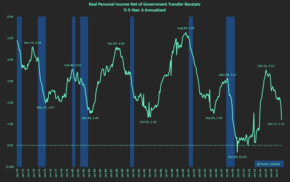
Real Income Growth Minus Transfer Payments
A transfer payment is a one way payment from the government to a person without anything given to the government in return. These social benefits include welfare, social security, disability and old age pensions, student grants, and unemployment insurance. These programs redistribute wealth. Socialists support these payments to promote economic fairness, while capitalists hate them because they create inefficiencies. For example, student loans have caused college costs to go up. Regardless of whether you think transfer payments are a good idea, if you are trying to gauge the health of the economy, the economy is healthy when transfer payments are relatively low because it implies fewer people need them.
The chart might explain why the government deficits are increasing even though the economy is in an expansion. Besides explaining expanding government deficits, this chart shows real wage growth is weakening. This type of deceleration hasn’t occurred outside of a recession going back to 1970. The population has aged in this cycle because of baby boomers, but that only explains why the average growth would be lower this cycle (increased dependence on entitlement programs). It doesn’t make up for the sharp reversal in the past 2 years. The current growth rate is where the troughs of the previous recessions were other than during the 2008 financial crisis.
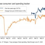
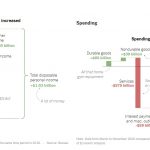
Total Credit Card Debt – Spending Beyond Your Means
The recent crash in the index explains the record total credit card debt. The average credit debt as of Q3 2017 per family (which caries this type of debt) is $15,654. With the high interest rates on credit cards, they can be financially crippling. Speaking of crippling, the average student loans per household is $46,567 for those who carry that debt. The average household with auto loans owes $27,669.
The U.S. consumer is undergoing a new grand experiment with debt. The debt taken out for housing, which really just amounted to speculation on prices for many people, didn’t work in the early 2000s. This time credit card debt, auto loans, and student loans are leading the charge. Each cycle there is a new place to take excessive leverage just like there’s a new speculative bubble each cycle. They all end the same with a painful deleveraging and a decline in prices. There are a few differences between the housing bubble and student loans which we discuss in Student Loans Are Not Like Housing Bubble.
As you can see from the chart below, the real consumer spending has exceeded real disposable income growth. Most people don’t have budgeting skills.
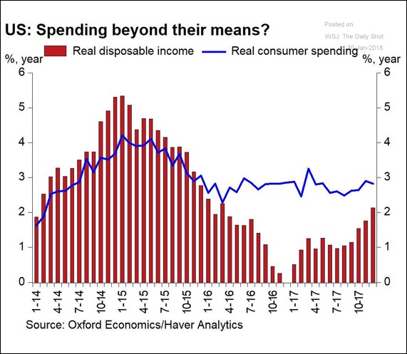
Real Consumer Spending Is Growing Faster Than Real Disposable Income Growth
The best practice is to be conservative with your mental math. Just like how you bring some extra cash to the store when you make a purchase, to be sure you’ll have enough, it’s a good idea to save a little bit more than you think you need to. Anyone can save if they have an income. If you think you can’t get by, let alone save extra money, you need to look at each spending item line by line to see what you need. There is no consumer good that is worth living a life where your financial future is spiraling out of control. Don’t be like most Americans who have excessive total credit card debt, car loans, and student loans. You can’t have compound growth on your savings if you’re in debt. You’re making the lender rich instead of yourself.
Positive Labor Trends
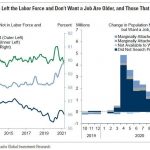
In the past 12 months the employment cost index has shown wage growth is picking up because the slack in the labor market has been tightening. In general, the U6 unemployment rate, which includes the underemployed or those working part time for economic reasons, has been falling faster than the headline U3 rate. From January 2016 to January 2018, the U6 and U3 rates have fallen from 9.9% to 8.2% and 4.9% to 4.1%, respectively. At the bottom of the previous cycle, the U6 rate fell to 7.9%. It fell to 6.8% in October 2000. This shows the rate is close to its bottom. As you can see from the chart below, the ECI has been showing positive signs in the past 1.5 years.
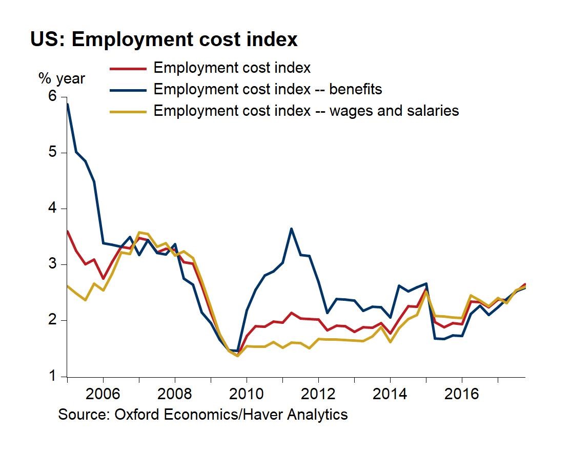
Wages & Salaries Growing At The Fastest Rate Since 2008
The benefits, wages, and salaries have been accelerating in concert. In Q4 2017, the ECI was up 0.6% quarter over quarter and up 2.6% year over year. That’s the fastest growth rate since 2015. The private sector wages and salaries were up 2.8% year over year which is the fastest growth rate since 2008.
The chart below breaks down the sectors where the employment growth is coming from.
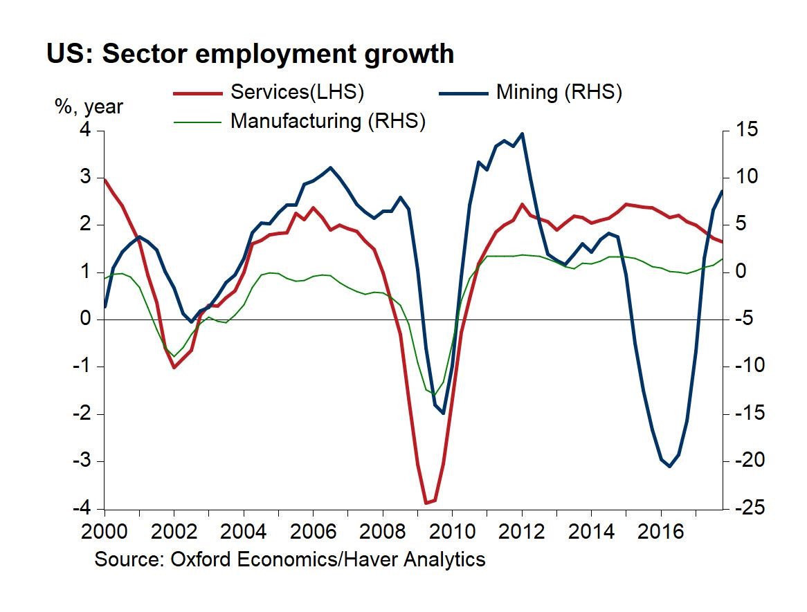
Mining & Manufacturing Accelerating & Services Decelerating
The manufacturing sector has recently perked up because of the weak dollar. Trump’s plan to help his base of voters in the Midwest who want manufacturing jobs to become more prevalent is working; the issue is the rest of the country isn’t a manufacturing bastion. The employment in services looks like it is peaking just like it looked in 2007 before the financial crisis. The mining sector is being helped by Trump’s focus on clean coal, but it’s mainly up because of the rally in commodities.
The Atlanta Fed wage growth differs from the ECI as you can see in the chart below.
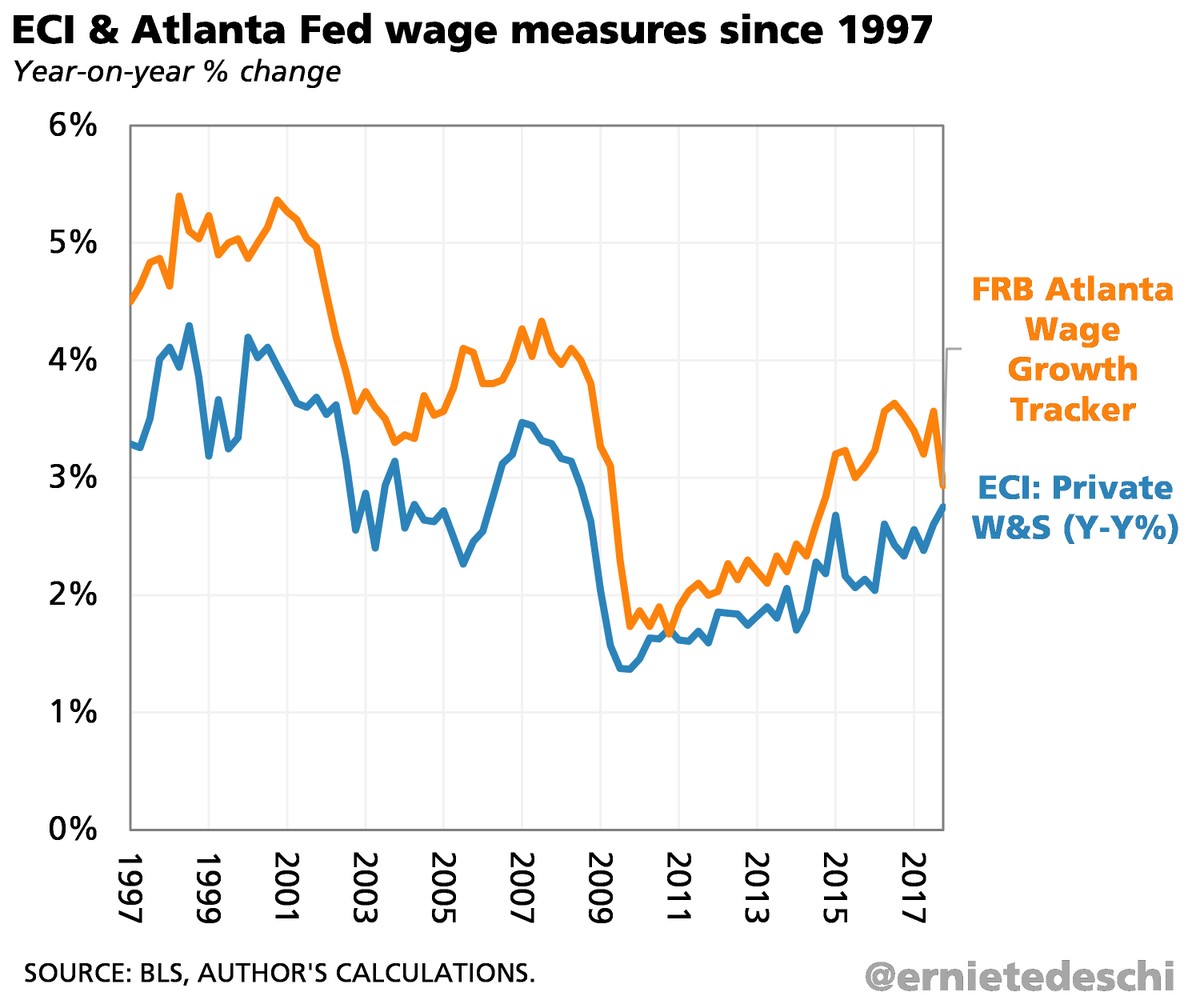
ECI & Atlanta Fed Differ
The Atlanta fed wage growth has fallen from 3.9% to 2.9%. Both correct for compositional changes in wages. The ECI does this by keeping occupational and industry weights the same. The Atlanta Fed tracker does this by only looking at the same workers 12 months apart. One aspect to consider is that the Atlanta Fed tracker is almost always higher. If you adjust for mean and standard deviation, both show closer results. They both have small samples, so noise is sometimes a factor. The latest decline in the Atlanta Fed wage tracker might be noise like the ECI decline in 2015.
Conclusion
We looked at the health of the consumer in this article. The consumer should be fine for the next year because the underemployment rate is low and the consumer will be getting a tax cut. Some are also getting bonuses because of the corporate tax cut. However, if the services sector continues its latest downtrend, the business cycle will be ending likely within the next couple of years. It could be a painful deleveraging for consumers because they are carrying excess total credit card debt, student loans, and auto loans.
If you are interested in reading more about consumer debt, here are some of our recent articles on the topic:
Have comments? Join the conversation on Twitter.
Disclaimer: The content on this site is for general informational and entertainment purposes only and should not be construed as financial advice. You agree that any decision you make will be based upon an independent investigation by a certified professional. Please read full disclaimer and privacy policy before reading any of our content.