UPFINA's Mission: The pursuit of truth in finance and economics to form an unbiased view of current events in order to understand human action, its causes and effects. Read about us and our mission here.
Reading Time: 5 minutes
There are positives and negatives with all economic analysis. If you want to be on the precipice of data analysis, then you will lose accuracy. However, looking at the hard data leaves you in the past. For example, the PCE report is one of the most important economic reports since it shows the hard data for income, consumption, and inflation. However, it is compiled and released about a month after the survey period is over. It usually doesn’t miss/beat expectations by much because we have so much data on the survey period, it’s difficult to be wrong. However, when it does miss/beat estimates, it’s a significant catalyst.
Those are the caveats when looking at the chart below. The regional manufacturing reports from the 5 districts which publish this data have been released for July. The Dallas report was the last to be released on July 30th. These surveys are volatile since they have small sample sizes and only cover each of their districts. These are the reports which help us understand where the ISM PMI is expected to be at.
The ISM PMI is itself a soft data report which helps forecast the hard data (industrial production). Recently we’ve seen a weaker correlation between real economic performance and the ISM surveys. However, the good news is seen in the chart below as the regional surveys have followed the ISM PMI.
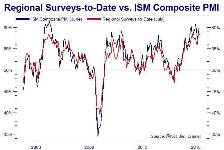
Source: Twitter @Not_Jim_Cramer
Since the ISM PMI moves markets itself because it is widely followed, these regional Fed surveys have a place in economic forecasting. The chart shows the regional Fed surveys imply the manufacturing PMI will be 58 which is below the consensus for 59.5 and below June’s report of 60.2. These minor misses could impact markets in the short term. If you’re trying to get an early look at the economy to make a long term forecast, it’s clear the soft data reports are maintaining the level they have plateaued at for the past 18 months. Industrial production is being helped by energy prices. If we strip that away we see solid, but not remarkable growth.
Speaking of prices, the regional Fed reports are showing extreme inflation with some records being surpassed. These early comparisons increase the odds for rate hikes. With the way core inflation is calculated, you can say the core CPI & PCE reports were constructed to not show high inflation since they strip away energy and food price changes. The regional price indexes give us a glimpse into the realities manufacturing firms are facing. It’s certainly a more volatile picture, but volatility is reality for businesses.
Research & Development
A big misnomer repeated by economists is that the weak productivity growth this cycle can be pointed to a lack of investment into research and development. This is an easy answer, but it doesn’t stand the rigors of a quick glimpse at the numbers. The Renaissance Macro chart below shows the R&D spending as a percentage of GDP.
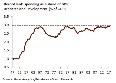
Source: Renaissance Macro Research
Investment in research and development has been relatively high this cycle. The combination of public and private investing in R&D hit a record high in Q2 2018 at 2.96%. In theory this will help productivity growth, but in reality, there won’t be an effect if the past cycle of data is any guide. Productivity growth was only 1.3% in Q1 2018. It’s possible the way the government measures productivity growth is wrong. The low productivity growth this cycle hasn’t been in tune with the decent real wage growth when you look at cycle average which suggests that real wage growth, though small, has been greater than the past three business cycles (this article includes chart to demonstrate this point). One other misnomer is the claim that stock buy backs are preventing investment. The only way you can believe this to be the case is if you selectively ignore the R&D chart above, which would not be objective analysis, unless you have a valid argument demonstrating that the chart above is not valid for some reason.
Earnings Look Good
Earnings growth in Q2 has been expected to be strong ever since the tax cuts were passed. We’re more interested with the recent changes to estimates and firms beating the consensus which included the expected gain from tax cuts. The results from the first 3 weeks of earnings season, in which 259 S&P 500 firms reported earnings, are very good. Bottom up EPS increased to $40.52 from $39.62 in the last week, in which the most firms reported earnings. 76% of firms beat their EPS estimates and 67% of firms beat their sales estimates. This is the highest EPS beat rate following week 3 results since late 2011 when BAML started measuring this data.
The Merrill Lynch charts below show the recent improvements which have nothing to do with the tax cuts.
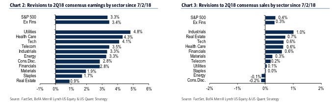
Source: Merrill Lynch
The S&P 500’s revisions pushed up EPS by 3.3% since July 2nd and pushed sales 0.4% higher. The all-important tech sector is doing great as its EPS revisions pushed results up 4.1% and its sales revisions pushed results up 0.6%.
Tech Has Been Weak, Which Is A Big Problem
Even though the tech sector has had better than average results, the sector has had its components perform the worst in the week following their earnings reports. The chart below shows the average return of tech stocks has been -3.5% in the 5 days following reports since mid-May to July 27th.
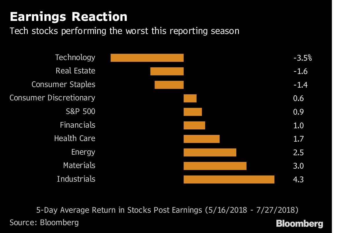
Source: Bloomberg
The sector has the best performance year to date which means this might be profit taking. S&P 500 investors who are positive on further gains hope this is profit taking because a long term bear market in tech would probably be bad for equity returns (ignoring the coming change in sector alignment). The BAML chart on the left shows the 5 losing sectors have almost canceled out the winning sectors excluding tech, meaning the tech sector is responsible for 98% of the gains in 1H 2018. We don’t like when this type of analysis is done for individual stocks without showing the losers because if you add up the contributions stocks with positive returns have added to the index, the percentage is much higher than 100% of the returns because there are stocks that are down. This chart shows the losers and the winners and does it by sector, making the simple point that tech is very important to the S&P 500.
The chart on the right shows FAANG (Facebook, Apple, Amazon, Netflix, Alphabet) is more important than tech because Amazon and Netflix are in the consumer discretionary sector.
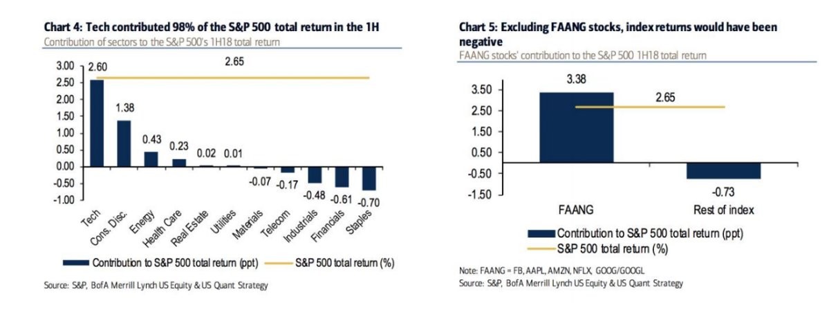
Source: Merrill Lynch
To be clear, the market isn’t unusually top heavy (as we discussed before). While it’s not unusual, it’s still noteworthy how important the leadership is to recent equity returns. The sector makeups will be changing on September 28th.
Conclusion
The Q2 GDP report showed 4.1% growth which is impressive. While the ECRI leading index suggests a slowdown is coming in the second half of the year, there isn’t much economic data to back that up. To be clear, the July hard data isn’t out yet, so that could change. The stock market has solid fundamentals since earnings growth was strong in Q2 and results beat heightened estimates. The only (probably temporary) problem is tech stocks’ weak reactions to their mostly great results.
Have comments? Join the conversation on Twitter.
Disclaimer: The content on this site is for general informational and entertainment purposes only and should not be construed as financial advice. You agree that any decision you make will be based upon an independent investigation by a certified professional. Please read full disclaimer and privacy policy before reading any of our content.