UPFINA's Mission: The pursuit of truth in finance and economics to form an unbiased view of current events in order to understand human action, its causes and effects. Read about us and our mission here.
Reading Time: 5 minutes
This article will pack in as many economic signals as possible without it being too overwhelming. The list below shows 5 groupings of indicators which tell us the likely future performance of the consumer. The situation looks great as 17 out of 18 indicators are favorable and only one is mixed.
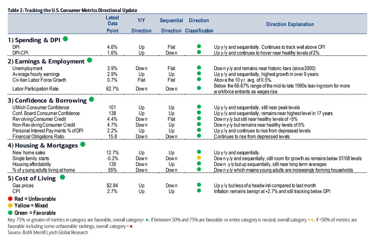
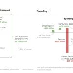
The first group shows disposable personal income growth and real disposable income growth. Both are up year over year. It’s not surprising income growth is up because the labor market is running out of slack. One example of this is Amazon recently announced it will give its workers a $15 per hour minimum wage. That’s not something you see early in the cycle when there is a high unemployment rate. To be clear, real disposable income growth is usually positive even in recessions. 1.6% growth is still decent considering inflation has increased in 2018.
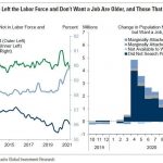
The second group shows the latest labor market statistics. Usually it’s bearish when the unemployment rate starts increasing year over year, but if it goes up because workers are coming off the sidelines, this cycle will be an exception. Average hourly earnings growth is at a cycle high and is not done accelerating because the slack in the labor market is running thin. The labor force is growing and the prime age labor force participation rate is increasing, showing us the labor market is strong. The overall labor force participation rate is stymied by demographics.
Rates Are Up, But The Consumer Is Healthy
The third group shows consumer confidence and borrowing growth. The only negative point about consumer sentiment is it’s manipulated by political bias. It’s still positive to see all readings extremely high. They have been correlated with year over year retail sales growth. Both revolving and non-revolving credit growth are positive and at healthy levels. This reinforces the point that the consumer’s balance sheet is healthy.
The personal interest expense as a percentage of disposable income ratio is increasing along with interest rates. The chart on the right shows the ratio is still historically low, meaning it’s healthy.
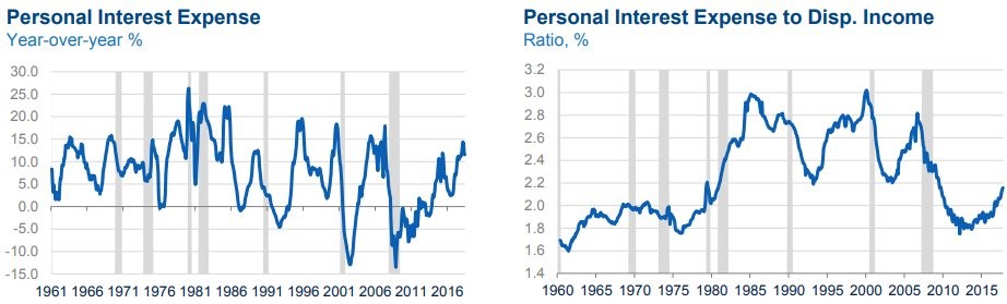
The growth rate on the left is high because the base is low. The financial obligations ratio is the ratio between household debt payments and disposable income. It’s still healthy as consumers have deleveraged this cycle.
The housing market is showing the weakest readings in the American economy. The only mixed reading in this list is the declining housing starts. Housing starts are up and fewer young people are living at home compared to last year. However, housing is less affordable which could stymie future household formation. Shelter inflation has been driving CPI this expansion. Affordability depends on location as some cities like San Francisco and Seattle are in a crisis, while others have more affordable housing.
Inflation Isn’t A Problem Yet, But It Might Accelerate
The final grouping is inflation. August PPI, CPI, and PCE inflation all decelerated even though the comparison was easy. Year over year comparisons will get tougher, wage growth will accelerate, and oil prices are becoming a problem. Large tariffs on Chinese products will raise prices. The chart below shows a potential path for inflation in the next few years.
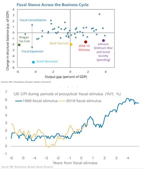
The top chart compares the past 4 fiscal stimuli by their size and timing in the business cycle. They were all about 2% of GDP, but they each started at different points in the business cycle.
A negative output gap is when the economy is operating below its potential. On this basis, only the Reagan tax cuts were timed correctly. The economy was operating at its capacity when the Bush tax cuts were passed. It was acting above its capacity at the start of the 2018 fiscal stimulus and the Great Society spending under President Johnson.
Since the 1966 fiscal stimulus and the 2018 stimulus were implemented, when the output gap signaled the economy was operating above its potential, the second chart compares their inflation rates before and after the stimulus. So far, the inflation rates have been correlated. If inflation keeps tracking the level seen during the late 1960s, it will accelerate sharply in the next few years.
The big bet the government unwittingly made with the 2018 stimulus is that there were enough workers on the sidelines who would apply for jobs when wage growth and demand for workers increased. We know there’s still slack in the labor market based on the prime age labor participation rate and the fact that jobs are being added at about twice the rate necessary to keep up with labor population growth.
U.S. Economy Operating Above Capacity
As was mentioned in the previous chart, the output gap signals the economy is operating above its capacity which signals more inflation is probably coming soon and that the expansion is near its end. The chart below shows the output gap since 1980.
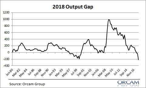
It’s calculated in the reverse manner as the previous chart which means negative numbers show the economy is operating above its potential. As you can see, the output gap is the most negative since at least 1980. It wouldn’t be a surprise to see the economy keep operating above its potential in the intermediate term because the yield curve is normal and the stimulus is still helping economic growth.
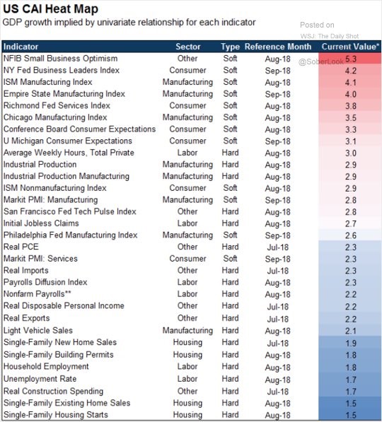
Soft Data Hot & Hard Data Cool
The economy could be seeing modest weakness in Q3 as growth decelerates from the torrid pace seen in Q2. One new negative trend we’ve seen in the past couple months is the soft data surveys have been running hot while the hard data has been mixed. One example is the hot ISM manufacturing PMI reading, which is soft data, compared to the moderate industrial production report, which is hard data.
Conclusion
The consumer is looking good outside of some weak housing stats. Inflation could increase because the stimulus occurred when the economy was already running above its capacity. The output gap should remain in its current state because of the positive tailwind from the fiscal stimulus and the normal yield curve. There could be a slowdown coming because recent hard economic data has been cool.
Have comments? Join the conversation on Twitter.
Disclaimer: The content on this site is for general informational and entertainment purposes only and should not be construed as financial advice. You agree that any decision you make will be based upon an independent investigation by a certified professional. Please read full disclaimer and privacy policy before reading any of our content.