UPFINA's Mission: The pursuit of truth in finance and economics to form an unbiased view of current events in order to understand human action, its causes and effects. Read about us and our mission here.
Reading Time: 5 minutes
It’s well known that the economy hasn’t been working for a large percentage of the middle class and majority of the lower class because real wage growth has been practically nonexistent in most sectors of the economy despite the labor market showing strength suggesting that there is not enough labor available to fill demand. On the positive side, wages earned in 2018 give the consumer much more value because of technological advances. Due to improvements in medicine and technology and overall quality of life, few people would rather live in the past than the present. Even though labor doesn’t have a high share of total wealth, the overall workers earning poverty level wages has fallen.
As you can see from the Economy Policy Institute chart below, the share of American workers earning poverty wages reached a record low in 2017.
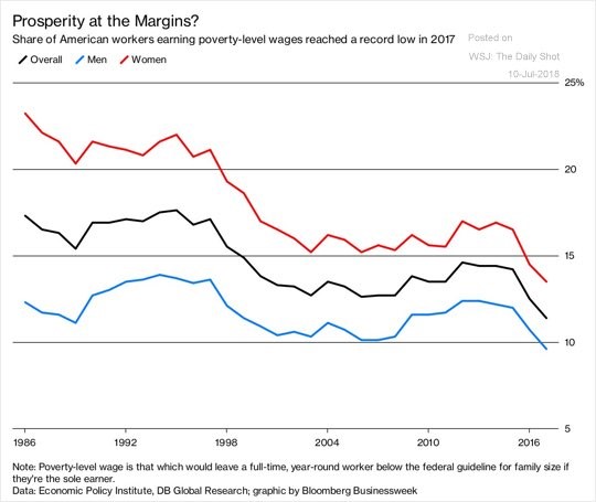
Source: Economic Policy Institute
The share declined from 17.3% in 1986 to 11.4% in 2017 despite the decline in the number of labor unions. The advancement of women in the workplace is evident as the share of women earning poverty level wages has declined from 23.2% in 1986 to 13.5% in 2017. To be clear, a poverty level wage is pay that would leave a full time worker below the federal poverty guideline for a family of their size if the worker is the sole provider for the family.
The Truth Is Less Clear
While the size of households has changed marginally, there is another catch to the chart above which is that the federal poverty line hasn’t increased as much as median income. Dropping the poverty line allows poverty to decrease without real wage gains. To be clear, Americans in poverty are much better off than the poor or even the somewhat well off people in poor developing countries. That being said, if you think the poverty line should be compared to median incomes, it is too low. The chart below shows the federal poverty line hasn’t increased as quickly as the median family income of a family of four.
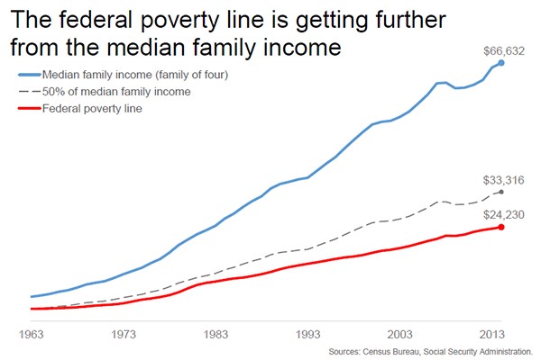
Source: TalkPoverty.org
In 1963, the poverty line was half the income of a median family of four. As of 2013, the poverty line was 66% below the median family of four’s income. If the poverty line’s ratio to median family income was the same as 1963, the poverty line would be $33,000 in 2013. Let’s look at the updated data to get a better understanding of this situation. From 2013 to 2018, the federal poverty line increased from $24,230 to $25,100. That’s an increase of just 3.59%. That’s an annual growth rate of just 0.7%. Median family income increased 6.9% from 2013 to 2016 which is an annual increase of 2.25%. The trend of median incomes increasing much faster than the poverty line continued.
It’s good to see median household incomes growing quicker than the CPI and it’s good to see poverty declining, but the poverty line hasn’t grown enough to celebrate. The culprit of this hesitance to increase the poverty line is that entitlements are given to more people if the line is raised. The difference between the current economy and the one in 1963 is stark. Medicare was signed into law in 1965 and food stamps were signed into law in 1964. The spending on these programs has increased significantly as the baby boomers are living longer. As of 1962, 31% of the budget went to entitlement spending and as of 2012 61.9% of spending was on entitlements. Spending would be even higher if the poverty line was higher.
The Poverty Line Is Accurate When Comparing It To CPI
The categorization of poverty is difficult to assert because it depends on whether you think it should be compared to median incomes or the cost of goods. As we mentioned, the poorest Americans are much more well off than people in developing poor countries. Technically, the poverty level is near zero according to that analysis. We showed above that the poverty rate would be higher if you compare it to median incomes which isn’t wrong or correct because the lines are blurred. Supporting the point of comparing the poverty line to median incomes is the American people as a 2016 survey showed people thought the poverty line for a family of 4 was $32,293, which was 34% higher than the actual level.
It’s fair to say that the poverty line should rise with CPI. If you assume the 1963 level for poverty was accurate, than the current level is exactly in line with where it should be, supporting the point that the economy has improved for workers in the past few decades. From 1963 to 2017, the poverty line went up 3.89% per year; the CPI went up 3.93% per year. Like we said, this assumes the 1963 level was correct; it also assumes the CPI is the best measurement of inflation. However, since the previous argument for comparing poverty to median incomes predicates itself on the point that the 1963 poverty line was accurate, it provides a legitimate counterpoint.
One final point worth noting is that people in poverty spend their money differently than the median family which means CPI may not be a great depiction of inflation for them. Housing takes up a higher percentage of poor people’s income; it has recently risen faster than the overall inflation rate. We detailed how housing has become unaffordable in this article.
Latest Data
Moving back to the latest economic data, which we like to highlight to determine the direction of the economy, the May JOLTS (job openings and labor turnover survey) report was encouraging. The total job openings were an abundant 6.638 million jobs. This was below April’s report which was upwardly revised from 6.698 million to 6.84 million. Don’t be concerned with the minor blip lower from April; the total job openings were up 16.7% from last year. The hiring growth rate was a bit slower as there were 5.754 million workers hired which was a 4.9% year over year gain. The total job openings are above the 6.564 million workers who are actively looking for work as of June.
Keep in mind, that data point had a big jump up from 6.065 million in May as many people jumped off the sidelines because they were so confident in their ability to get a job because of the strength in the labor market. Job openings being higher than the number of unemployed people looking for work means the labor market is exceedingly strong. This inversion started in April, marking the first time it occurred in 20 years of data. The Haver Analytics chart below shows the quit rate also increased 1 tenth to 2.4% which means people are so confident in the labor market that they quit their current job to find a new, better paying job. The chart below shows this implies the employment cost index will increase.
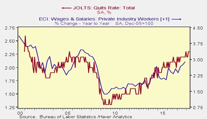
Source: Haver Analytics
Conclusion
We discussed some good and bad trends. The good news is the percentage of women getting paid below the poverty level has fallen quicker than men. They have caught up as the percentage of women getting paid below the poverty line was 10.9 points higher than men in 1986 and it was only 3.9 points higher in 2017. The bad news is the decline in poverty level jobs is partially because the poverty level hasn’t increased as much as median incomes. The government needs to limit the poverty line’s increase to avoid entitlement spending growing even quicker than it has grown already. The good news is this cycle is showing promise because the quit rate is increasing which implies the ECI index will increase further.
Have comments? Join the conversation on Twitter.
Disclaimer: The content on this site is for general informational and entertainment purposes only and should not be construed as financial advice. You agree that any decision you make will be based upon an independent investigation by a certified professional. Please read full disclaimer and privacy policy before reading any of our content.