UPFINA's Mission: The pursuit of truth in finance and economics to form an unbiased view of current events in order to understand human action, its causes and effects. Read about us and our mission here.
Reading Time: 4 minutes
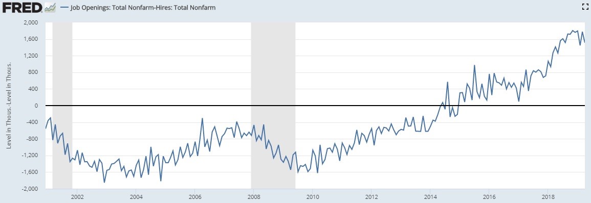
For much of the JOLTS report’s recent history, we have seen the gap between job openings and hiring increase. The chart below shows openings have been above hires since 2015. Hiring hasn’t kept up with openings which has been a negative in this report.
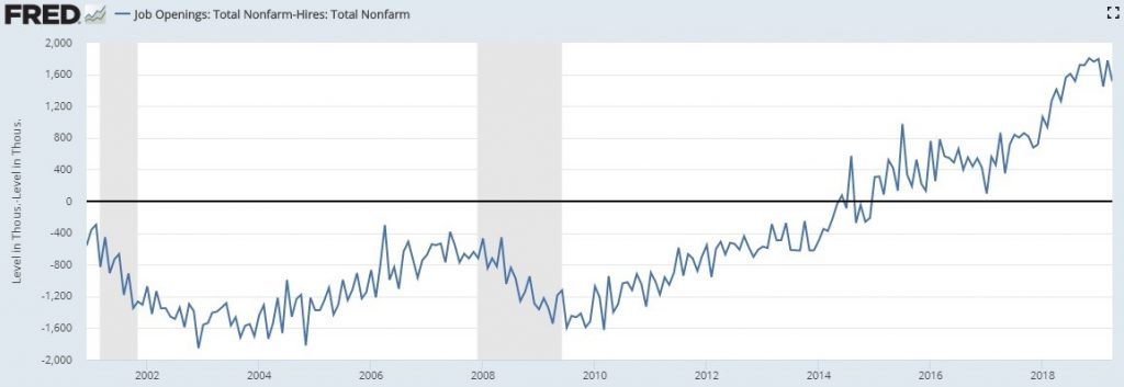
We agree with the bears in that if hiring doesn’t increase, it really doesn’t matter how many openings there are. It’s good to see employers looking to hire people, but if they don’t actually hire anyone, then there’s no benefit to the economy.
Intermediate Term JOLTS Trend
Higher openings than hires gives off the signal that there aren’t enough workers to fill the vacant job openings. Any individual firm can fill an opening if it’s willing to raise pay enough or train inexperienced workers. The question is if they all could hire the workers they need if they were 100% serious about finding workers and paying them fairly. The prime age labor force participation rate doesn’t agree with JOLTS as it shows there is still supply in the labor market. The data from JOLTS only goes back to 2000, so our ability to analyze this record breaking cycle is limited.
Details Of The April JOLTS Report
Openings were solid as they fell slightly from 7.474 million to 7.449 million. You can see in the top 2 charts below, the opening rate is just below the cycle peak which was a record peak.
The weakest region was the South which had openings fall from 2.846 million to 2.814 million. The Midwest had the only increase as it went from 1.729 million to 1.787 million. Retail trade’s openings oddly increased from 825,000 to 837,000. That’s odd because the industry has seen the most job cuts this year. There was notable weakness in professional and business services which fell from 1.413 million to 1.241 million.
While hiring has been weak relative to openings this cycle, that wasn’t the case in April. Total hires had a big increase as they went from 5.697 million to 5.937 million. The yearly growth rate improved from 1.3% to 4.3% which is near the midpoint of where it has been this cycle. The later in the cycle we get, the more impressive growth is because the labor market is filling up.
Every region had sequential hiring growth in April. The strongest improvement was in the Midwest which saw hiring increase from 1.195 million to 1.306 million. Here professional and business services improved as hiring was up from 1.173 million to 1.233 million. This industry’s hiring growth improved from -0.2% to 6.5%. Retail trade hiring went from 725,000 to 750,000. As the bottom two charts below show, the quits rate was stagnant. It stayed at 2.3% overall and 2.6% for private firms. Both rates are at cycle highs.
2% Chance Of A Recession Now
The Sahm Recession indicator uses the unemployment rate to come up with the odds of a recession. This calculation eliminates some of the noise that’s created by the month to month shifts. The indicator is the 3 month average of the unemployment rate in relation to the prior 12 month low. The current rate is at the cycle low. The current 3 month average is slightly above the 12 month trough which is the current level. According to the table below, that means there is 2% chance the economy is in a recession now. There’s only an 8% chance of a recession in the next 6 months. The bears would strongly disagree with that.
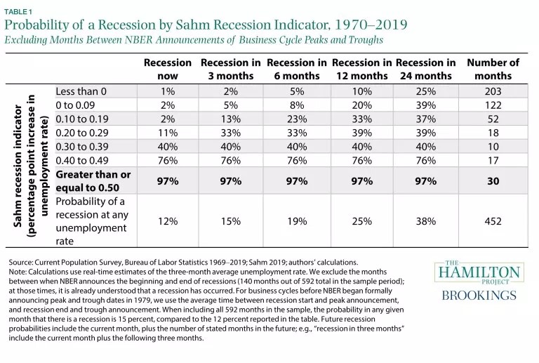
Keep in mind, that since 1970, this indicator has never called for a recession that didn’t happen and has successfully predicted each one. The key threshold is when the indicator is equal to or greater than 0.5 at which point there is a 97% chance the economy is in a recession. The data in this table excludes when NBER has stated the economy is in a recession. That’s because at those times it’s already understood a recession occurred.
Yield Curve Inversion
Prior to the past year, the 10 year 2 year spread was the most popular curve to follow. However, once some other parts of the curve started to invert, they became more popular because each inversion was a news event which generated attention. The 10 year 2 year spread still hasn’t inverted. Curves like this staying normal explain why many bond investors say the market is pricing in Fed rate cuts, not a recession. The curve could change if rate cuts don’t come.
With that being said, the top table shows recessions occur a median of 20 months after this inversion.
The returns are from the inversion to the start of the next recession. Stocks do solidly as the S&P 500 increases a median of 6.5% and the MSCI World index increases 4.2%. Only gold falls. The 2nd table shows the 10 year 3 month curve inverts closer to recessions. That’s probably because that’s harder to achieve since 3 months is further along the curve than 2 years. However, because the Fed is expected to cut rates, this inversion has occurred first. The returns are similar, as all are positive except gold.
The Rent Is Too High
The chart below shows how unaffordable rent has become.
This puts understandable data behind the CPI numbers which show shelter inflation driving overall inflation. CPI is an abstract concept, while seeing how much of renters’ disposable income goes to rent is a real life concept. It’s a red flag if mortgage borrowers have 40% of their disposable income going to their house payment. Meanwhile, renters are at 37.5%. It became more affordable to buy a house after the housing bubble burst, but rent as a percentage of disposable income has kept rising. Even if house price growth falls further, it’s tough for millennials to save for a down payment when so much of their income goes to rent. Plus, they have student loan debt.
Conclusion
Hiring was strong in April. There is almost no chance the economy is in a recession now because the unemployment rate is so low. The yield curve is partially inverted. Inversions aren’t bad news for stocks until recessions start. Renters are spending a record percentage of their disposable income on rent. Either rent has increased exorbitantly or people have moved into more lavish rental units.
Have comments? Join the conversation on Twitter.
Disclaimer: The content on this site is for general informational and entertainment purposes only and should not be construed as financial advice. You agree that any decision you make will be based upon an independent investigation by a certified professional. Please read full disclaimer and privacy policy before reading any of our content.