UPFINA's Mission: The pursuit of truth in finance and economics to form an unbiased view of current events in order to understand human action, its causes and effects. Read about us and our mission here.
Reading Time: 6 minutes
Note: Our goal is to follow the facts, wherever they may lead. If your argument is better, let us know and we will adjust our framework. While sometimes events appear to be white or black, often the truth is in the middle, a muddied up gray, therefore rarely are their simple conclusions, or straightforward rationalizations, given that the economy is a complex system.
Many bearish investors discuss the possibility of debt causing damage to the economy. While there’s no question government debt is out of line, the private economy is a little more complicated. This is similar to how public pensions are in much more danger than private ones. Debt naturally goes up along with assets as we previously reviewed in Cost of Debt vs Cost of Equity: What’s Driving Markets?. Only looking at debt however isn’t a value added service and misses half the picture. If analysis simply shows a debt chart increasing and offers no context for the situation, it’s not really analysis.
Every action in the economy is caused by an equal and opposite reaction. For example, prior to 2008 the housing market exploded partially because banks were lending to borrowers without documents proving an income source. That was only one factor, albeit a large one, but a bigger one was low interest rates that fueled the speculation. The housing market implosion post 2008 is now being used as a reference point for another crash in the future. However, the current situation is different, as we detailed in Housing Market Leverage, therefore the consumer debt can’t be compared on an apples to apples basis. Banks have learned their lesson (mostly) and now don’t lend without more stringent safeguards.
Net Worth Versus Disposable Income Ratio
One example of positive context for the increase in consumer debt is the net worth as a percentage of disposable income seen in the chart below.
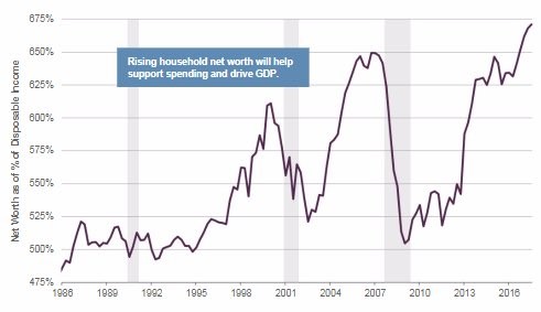
Net Worth As A Percentage Of Disposable Income
The ratio has reached the highest point in the past 30 years. This increase in net worth could help support consumer spending which drives GDP growth. Clearly this ratio is being driven by asset prices rather than savings, which are dismal as we reviewed in Delinquencies & Savings Rate: Truth In Details. When housing fell in 2007, America’s net worth plummeted. It’s interesting to see that during the past two recessions, net worth never fell to below 5 times the disposable income.
The obvious explanation of the lack of a decline below 500% is that America is resilient to woes since it is such a wealthy nation. An alternative argument is that both net worth and disposable income decline during recessions. Net worth falls because stock prices and other assets fall and disposable income falls because people lose their jobs. The fact that net worth has risen so much in this cycle might be a testament to the fact that stock prices have risen faster than wages, since real wage growth has been practically nonexistent for a large percentage of the population. US asset valuations are at extreme levels compared to global markets while wage growth is below the previous two cycles.
Did The Fed Cause Inequality?
The multiple of household net worth to nominal GDP is at a record high because asset prices have risen so much this cycle. An interesting debate comes from this topic. Many observers believe low interest rates and QE have created an asset bubble. Whether this is true or not is immaterial to this discussion, so let’s assume it’s true. The argument in favor of the Fed pushing up stocks is it creates a wealth effect which is when households spend more money because they have a higher net worth.
The chart below describes this correlation by comparing consumer confidence to changes in net worth.
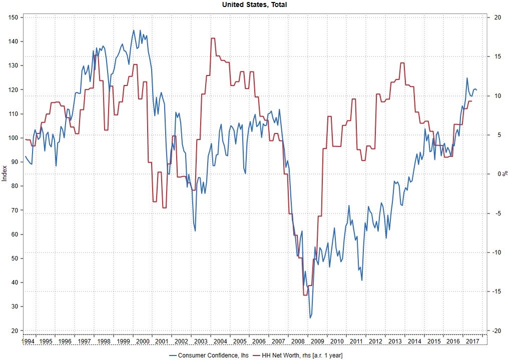
Wealth Effects
The second argument is that the first round of QE helped stabilize asset prices and restore confidence to the financial system. Regardless of the catalyst most business cycles recover on their own. When asset prices get to low, buyers step in. The Fed doesn’t need to prevent assets from falling to zero because investors won’t let that happen.
Now let’s look at the criticism low rates and QE face. The first is that asset prices have been pushed too high which makes the stock market look like a house of cards. Stocks have above average valuations, but there hasn’t been a collapse, so the house of cards narrative hasn’t been proven yet. This doesn’t mean its wrong or right. The second argument is that improvements in asset prices create inequality. It’s weird to hear an argument against asset price appreciation from critics of the Fed who are generally capitalists. It’s an insincere argument which aims to be critical of the Fed, at all costs. This type of flailing does no good because asset price appreciation would occur in a purely capitalist economy. Increasing asset prices is great for those who own them, and less so for those who don’t, since the cost of living increases. The large majority of the wealthy achieve their gains by providing products and services that customers value more than their money, thus making an exchange possible. The problem with poverty is separate from how well the wealthy are doing. We should want everyone to be wealthy.
Looking At Wage Growth On A Global Scale
Wage growth hasn’t been where most economists expected it to be in America this business cycle. Disappointing wage growth doesn’t mean that asset price appreciation is bad, it simply means asset price growth can’t solve every economic problem. If you expected rising stock prices to boost wage growth you’re building a straw man argument aimed at attacking capitalistic wealth gains. One of the reasons wage growth in America hasn’t been where economists expect is because of the increase of the global labor supply after communism fell in the early 1990s, such as in eastern Europe or in terms of new government policy opening up to Western investors, as was the case with China.
The Phillips Curve is the inverse relationship between unemployment and inflation. The problem with the Phillips Curve in western/central Europe and the US is inflation hasn’t risen even though the unemployment rate has been low. This solution is shown at the global level in the chart below as the unemployment gap and inflation have the same relationship they have always had.
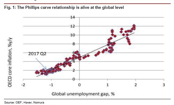
World Phillips Curve
To be clear, a positive output gap, which we have now, means the economy is producing more than its potential (unemployment is too low) and a negative output gap means the economy is below its potential output (unemployment is too high). This chart supports the idea that the increased labor supply in China, east Europe, and Russia helped push down wages in America. This means the improvement in asset prices is not solely responsible for the inequality issue in the United States. Some might read this to state that tariffs and import restrictions are needed, however nothing could be further from the truth. The benefit of the increased supply of labor worldwide is that the cost of goods and services is the cheapest it has been, which improves the quality of life for Americans and everyone worldwide.
Conclusion
Hopefully, this article helped contextualize some of the economic changes which have occurred this cycle better than the simplistic analysis some bearish investors give which begins and ends with there being too much debt. Whether or not the Fed caused the asset price increases, the net worth improvement does help consumer confidence for those who own assets. While the wealth effect does not come at the expense of the working poor, it doesn’t help them necessarily either if the cost of assets like real estate increases beyond their means. One of the significant factors that is often overlooked, yet an important contribution to low wages in the US for certain segments of the economy is the increased supply of labor in eastern Europe and Asia. This also helps explain why the Phillips Curve hasn’t been effective in the developed markets.
Have comments? Join the conversation on Twitter.
Disclaimer: The content on this site is for general informational and entertainment purposes only and should not be construed as financial advice. You agree that any decision you make will be based upon an independent investigation by a certified professional. Please read full disclaimer and privacy policy before reading any of our content.